Today we’re answering the question: when it comes to doing our own projects, do creative agencies follow the same process they apply to their clients?
In this 10-minute read, we pull back the curtain on Cadence’s recent website overhaul, the process we followed, and how we made design choices along the way. We’re skipping the polished, corporate recap to give you a raw, honest look at our own missteps, pivots, and breakthroughs so you can protect your timeline, budget, and sanity on your next digital project.
A short version:
- Auditing = chef’s kiss. Why a simple “freshen up” is rarely enough and how to find the data hidden in your current site.
- The Marie Kondo approach. Why you need to organise your site’s information architecture so users can actually find your digital “sock drawer.”
- LEGO-style design. The power of building with flexible, reusable blocks instead of rigid, mismatched pages.
- Our biggest learnings and greatest tips. Striking the perfect balance between your brand and client work, mastering the developer handover, and why great website copy actually comes after the design system.
- The post-launch reality check. What website testing actually looks like and why no site survives first contact with real users without a few bumps.
A: Start with your current website and audit the heck out of it.
So often clients say to us “don’t look at our current website, it’s not very good”. But have you considered that looking at your current site might be the best place to understand what your new site needs? Your current site is a treasure trove of data that can guide you to make it better the second time around.
For us at Cadence, we already knew we needed a new website, because our brand had evolved since the last one was built. We didn’t want to spend ages on it, just a classic “freshen up” project – simple. In our first meeting we said to each other, “just build the same thing again, but modernise the user interface”.
But, then a smart cookie on the team decided to do the due diligence and properly audit our old site first. That was when we realised we didn’t have a value proposition on our site. Or a list of our services. Or an FAQs page. Or anywhere to post articles to help our clients. Oh and the images on our case study pages were too small. And the filter mechanism wasn’t resonating with users.
The audit ended up being crucial to our decisions moving forward. We didn’t want to reskin anymore. We wanted to build something new and fit-for-purpose.
Takeaway
So when you’re considering a website refresh, don’t skip the audit. Open your site’s back-end and take a look at the data and see what gets clicked on most. Grab your mum and run a usability test on it. Go through the functionality with a fine-tooth comb. You won’t regret it.
A: We created our very own taxonomy because we really needed it.
Good Information Architecture (IA) is the backbone of usability. The problem is, not many people understand what IA is. Put simply, it’s the way you order the information on your website. A bit like Marie Kondo – everything needs to have a place, and a label – and those places and labels need to be intuitive so that any user stumbling into your house (website) can navigate their way through to the bedroom (work page) and find the sock drawer (case study) they’re looking for.
You need to have a strategy. You cannot just guesstimate the structure.
So, for the first time, our team sat down and designed a taxonomy for our business. We brainstormed all the possible “topics” that might live on the new website. Our services (strategy, design, video, web etc), our clients (non-profit, education, aid, mission, health etc), our skills (design, coding, writing, consulting, researching etc). It was like pulling all the clothes out of the cupboard and looking at them. There’s still room for improvement – yes, we do need industry specific aggregated pages – but service-led approach was the priority.
Then it was time to sort. We spent a few weeks working out what topic went where. Did we split our services up into creative and consulting? Did we differentiate between market research and user research? We did this through a process called “card sorting”. This is where you lay all the individual ideas out on little cards, and ask each of your users (or in our case, team members) to sort them into groups that are meaningful to them. This process reveals the way people expect to find your website ordered – and that is the most important thing. We want our website to make sense to as many visitors as possible.
Takeaway
Put as much time and effort you can into the IA as possible. Consider the mind palace of your organisation and how it can be ordered simply and beautifully.
Q: Did you design your website all at once?
A: No. We designed by blocks first, then pages.
Believe it or not, our old site was designed page by page. Every page was constructed individually. And some of them didn’t even match. Creative director’s nightmare, I tell ya.
This time around we created a collection of reusable blocks that could be mixed and matched to form unique pages across the site. Think of them like LEGO pieces.
We started with the basic blocks: headers, text sections, images, quotes, and contact forms. Once those were in place, we moved on to the more custom blocks that solved specific needs.
The Projects Highlights section came from a simple challenge: how do you showcase your best work without expecting someone to read eight full case studies? The result was a kind of tasting plate of projects.
The Services section was our attempt to answer a question we hear all the time: “What exactly does Cadence do?” We landed on a fact-sheet style approach that brings together services, team members, and project examples for each of our disciplines.
And then there was the Values section, which exists partly because we had a set of values to share, and partly because we couldn’t resist the idea of a deck of shuffling cards.
Takeaway
Not every site is best to build with only blocks but it is a helpful way to systemise a pretty complex bit of design. Your developers will thank you and you will thank you when you see how neatly and cleverly your site looks and importantly, works.
Q: As an agency, how did you balance showcasing client work with showcasing your own brand?
A: We started with our clients, then added our brand flare.
So on the first pass of UI design we took a purely functional approach. As our senior designer Linda told me, “The main idea was to make sure one element could not be mistaken for the other.” She’s smart. So we got our grid system working (aka the “bento box”), we designed our buttons and tags and tabs. We created layouts and flows.
Then we did a sweep to ensure that the work of our clients came before our own branding.
Then very gently… we added in the Cadence flare.
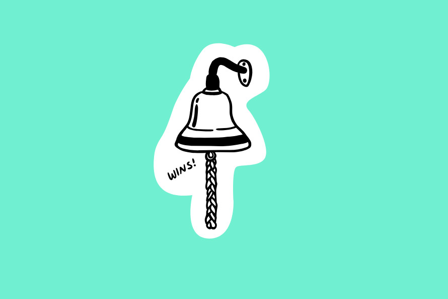
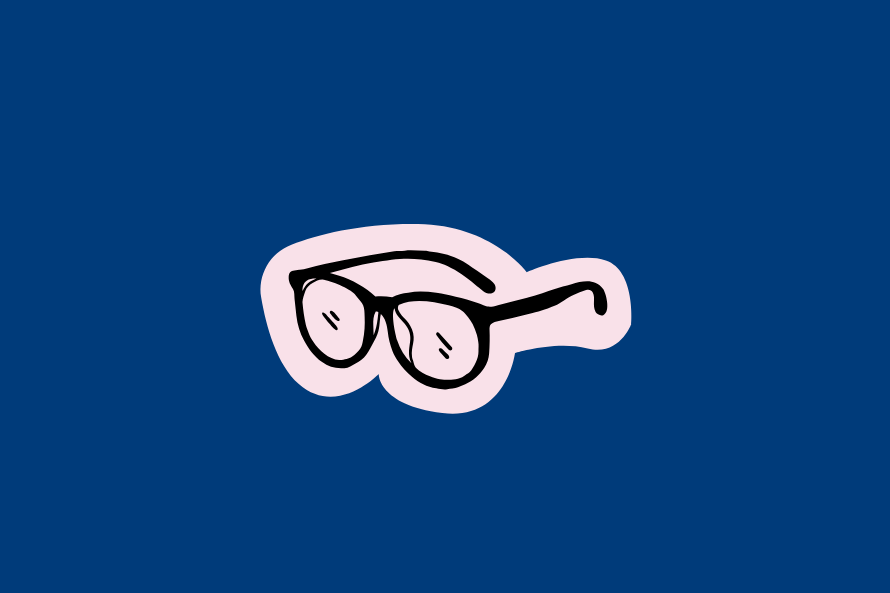
We designed a bespoke set of illustrations inspired by objects from our office that make us, us. Coke Zero cans collected by Brendan, indoor plants that Tahls keeps alive, the victory bell we ring at the end of a project, and even Rich’s glasses. Then we lightly sprinkled them into the otherwise utilitarian design to bring a touch of magic.


We also refused to design a black website, hence the Cadence blue, which for us, is a neutral colour.
Finally, we added some motion design. Sliding tickers. Cute hover effects. Shuffling objects. The eyes on the globe even follow your mouse around the page, if you look close enough.
Takeaway
When Cadence is designing your website, we’re focused on what your audience is looking for – not on what you can show off most about yourself. A good question to be asking is, “Does my website answer the primary needs of my audience, or is it serving the needs of the organisation?” If the latter, something needs to change.
Q: What’s the best way to hand a website over to developers?
A: Assumptions make an ass of you and me. You need a rigorous handover.
If you’ve ever been part of a website redesign project, you might know that there’s a lot that can go wrong between the design phase (wireframes and page mockups) and the development (the build and coding of a site). So how do you make sure everything gets translated accurately?
There’s some things we always do at Cadence to ensure we set our dev team up for success. And it might surprise you to hear we didn’t skip any of these steps for our own website project.
First, we always give our developer a master style guide document — aka. “The Law”— that governs fonts, colors, ratios, and any design hierarchy. We don’t just hand over design files and leave it up for interpretation. Second, we supply “Dev notes,”— detailed annotations added throughout the website page mockups that tell developers exactly how each block should behave or how something should respond to a user (e.g. carousel movements, hover effects, interactions). Third, we supply a defined set of breakpoints and rules so the site looks just as slick on a phone as it does on desktop. Finally, our designers are directly involved in the handover, and stay available to the developers throughout the build because questions always pop up.
It’s a time-consuming process, and clients sometimes raise their eyebrows at the amount of detail we’ll go into at this point. So why do we do it? It’s very simple. It’s much easier and cheaper to edit a site before development than after. If we catch issues early and have them resolved before development, it saves time, money, and wrinkles.
Takeaway
Don’t just throw your designs over the fence. Invest the hours into a comprehensive design system and clear dev notes. Your developers (and your sanity) will thank you later.
Q: At what point do you write the website copy?
A: We write the content and load it AFTER the design system is complete
Writing for web is it’s own art form. For our website, we wrote to fit the experience design, and not the other way around. Why? Websites are not static documents. You need to take into account the flow, and prepare copy that is the right style and length, that will make sense to the user at that moment in their journey.
For this reason, all the copy and imagery came together after the shell of the site was built. This is the part of the website process that surprises our clients the most. They often expect the site to be built around copy and when it’s not, they make a common mistake of trying to fit too much copy into the layout.
Once we knew what our site needed on it – case studies, Cadence’s creative philosophy, and information about our services – we then went about gathering and sorting the information we needed. It was a big job with lots of spreadsheets and checklists. Once everything was compiled, the copywriting began. Our senior writer, Naomi applied her tried and tested copywriting principles to the words on our website:
- Always come back to the value proposition. Why should someone choose [insert the product]?
- User first writing. Who is reading this? Why would they care? How can we answer their needs?
- Consistency. Keep the language, quality, and thoughtfulness consistent across all written communication.
- Syntax. No more than two concepts to each sentence and shape copy with different sentence length.
- Less is more. Make what you’re writing as smooth and easy as possible to understand. Can people get what they need quickly? If not, cut cut cut.
Takeaway
We’d strongly recommend writing your copy after you’ve at least wireframed a site and considered how it will function. If you’re writing for your website rather than forcing your copy into a site at content load, you’ll thank yourself.
Q: How much testing does a website really need?
A: How long is a piece of string?
No website survives first contact with real users. That’s why we launched the site a few weeks before announcing it. In fact, the day it went live we realised that the site didn’t scroll, and it took some time to fix. Fairly important.
What is testing?
Testing a site is essentially the process of seeing if the website is working the way it should. Like a test drive of a car in many different conditions. When we test sites, we’re seeing if the user can do what they need to do on a site like find information, buy a product, donate, search, access the menu, browse a range of items. Can they do this consistently? Can they do this on multiple devices and on different browsers? This is testing.
How did we test?
We tested internally and had members of our team who were unfamiliar with the site check it with fresh eyes. We tested it on different devices and browsers. We tested the main functionality of the site – did the forms notify our team and get logged for follow-up? Did searching the site return the results we’d expect? After the early testing, we did a “soft launch” of our site (we made it live without telling anyone) for about a month and checked it for bugs over that time. Why? Because it’s very normal for sites to have issues after they go live. We use specialised programs to track any issues and often have weekly meetings to discuss outstanding problems and find solutions.
Testing is an in-depth process and a crucial one. After the site is officially live, often our clients comment that this was the part they were most surprised about, both in how important it is and how much work it was.
Takeaways
If you want it to go faster, have more people look at it. Put together a team and create a process to log issues and resolve them.
What’s next?
At the end of the day, rebuilding a website – even your own – is a masterclass in patience, planning, and a healthy dose of humility.
Ready to tackle your own website redesign? Get in touch with the us. We’ll bring the strategy, the dev notes, and maybe even a few Coke Zeros.