
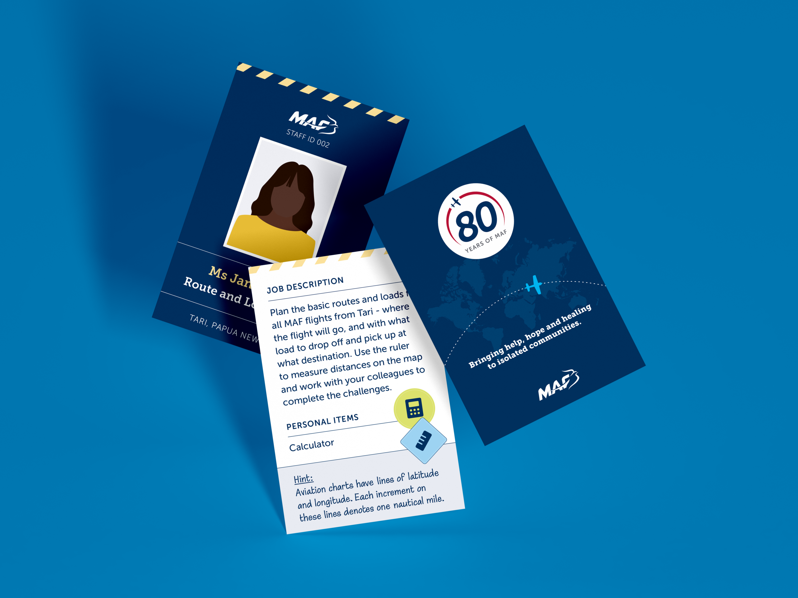
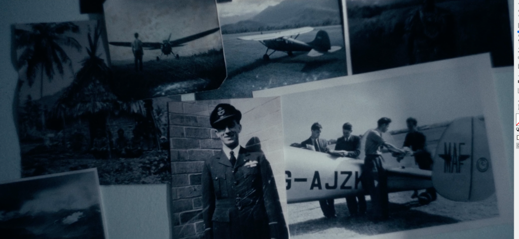
MAF: An immersive plane experience
Building on our long-term partnership with MAF, Cadence was invited to create an immersive experience to mark their 80-year anniversary. The goal was to design a walk-through journey that allowed attendees to step into the shoes of a MAF pilot, from pre-flight preparations to landing in remote communities. To make this engaging, we turned the real-world challenges MAF teams face daily into a series of problem-solving games. We designed custom puzzle pieces and interactive elements that required attendees to solve logistical hurdles to move through the event.
- Aid and Devleopment
- Faith-based
- Mission Aviation Fellowship (MAF) Australia
- Visual Identity
- Large Format and Signage
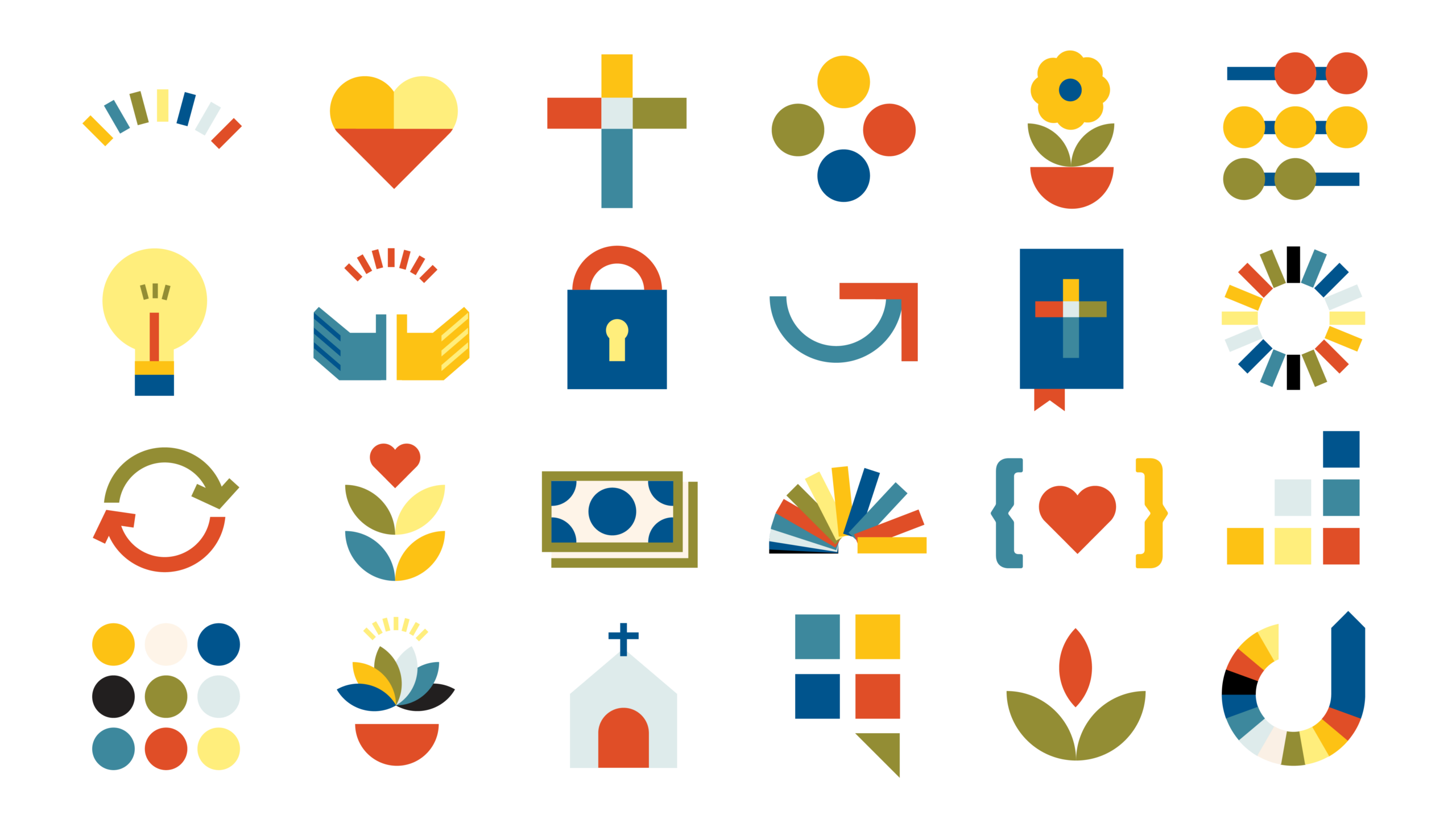
- Iconography
- Logo and Brand
- Marketing Strategy
- Product Design
- Editorial and Print
- 2025
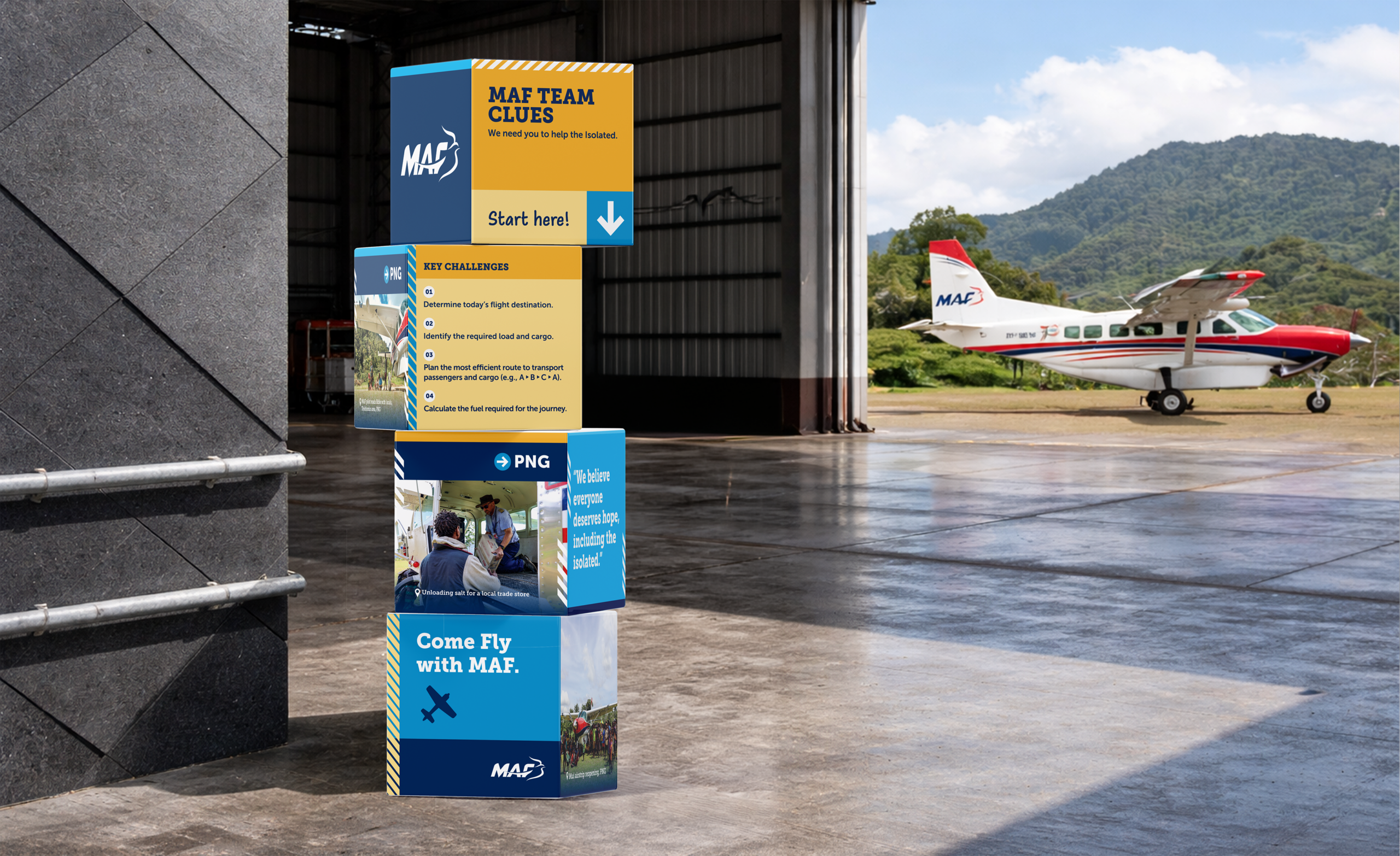
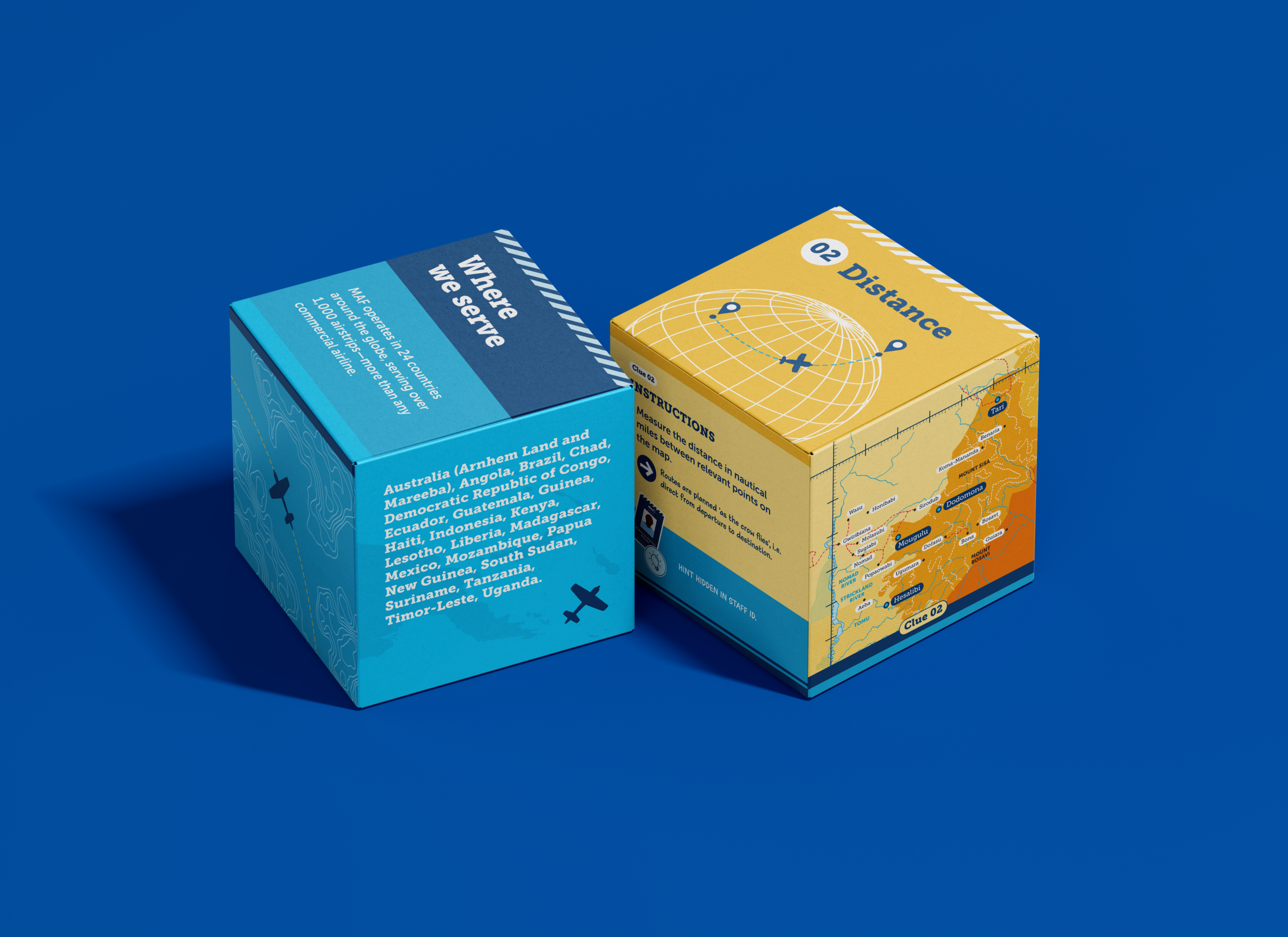
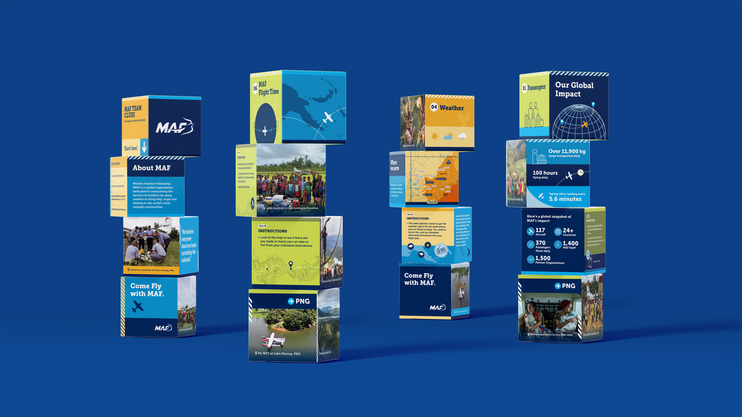
By turning MAF’s daily operational challenges into an interactive journey, we helped attendees connect with an 80-year legacy of service through a hands-on, problem-solving experience.

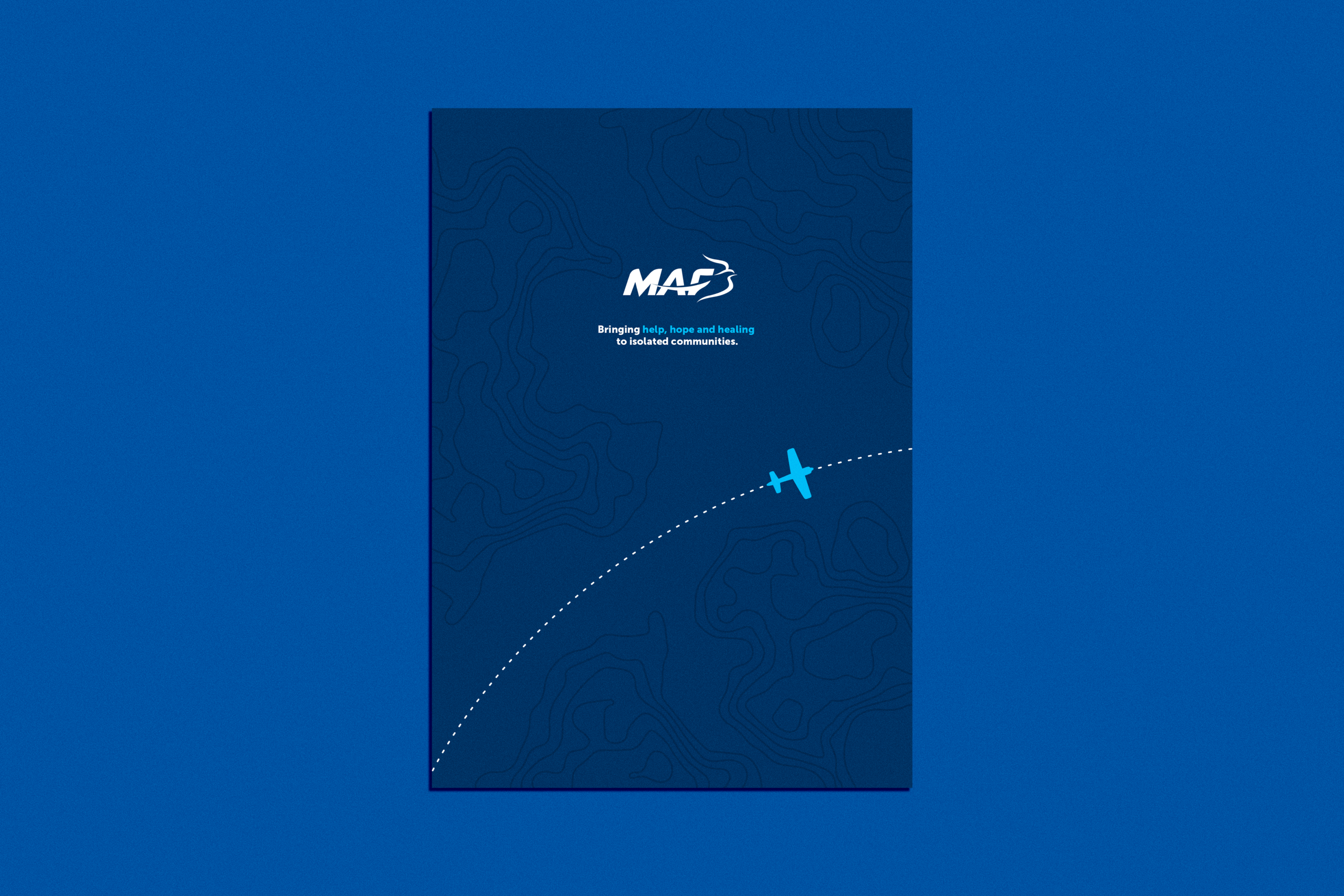
We thank the Mission Aviation Fellowship (MAF) team for their continued partnership and for the opportunity to help celebrate such a significant milestone. We are particularly grateful to the pilots who shared their stories and technical expertise, and for the chance to experience a MAF flight firsthand to better inform our design process.
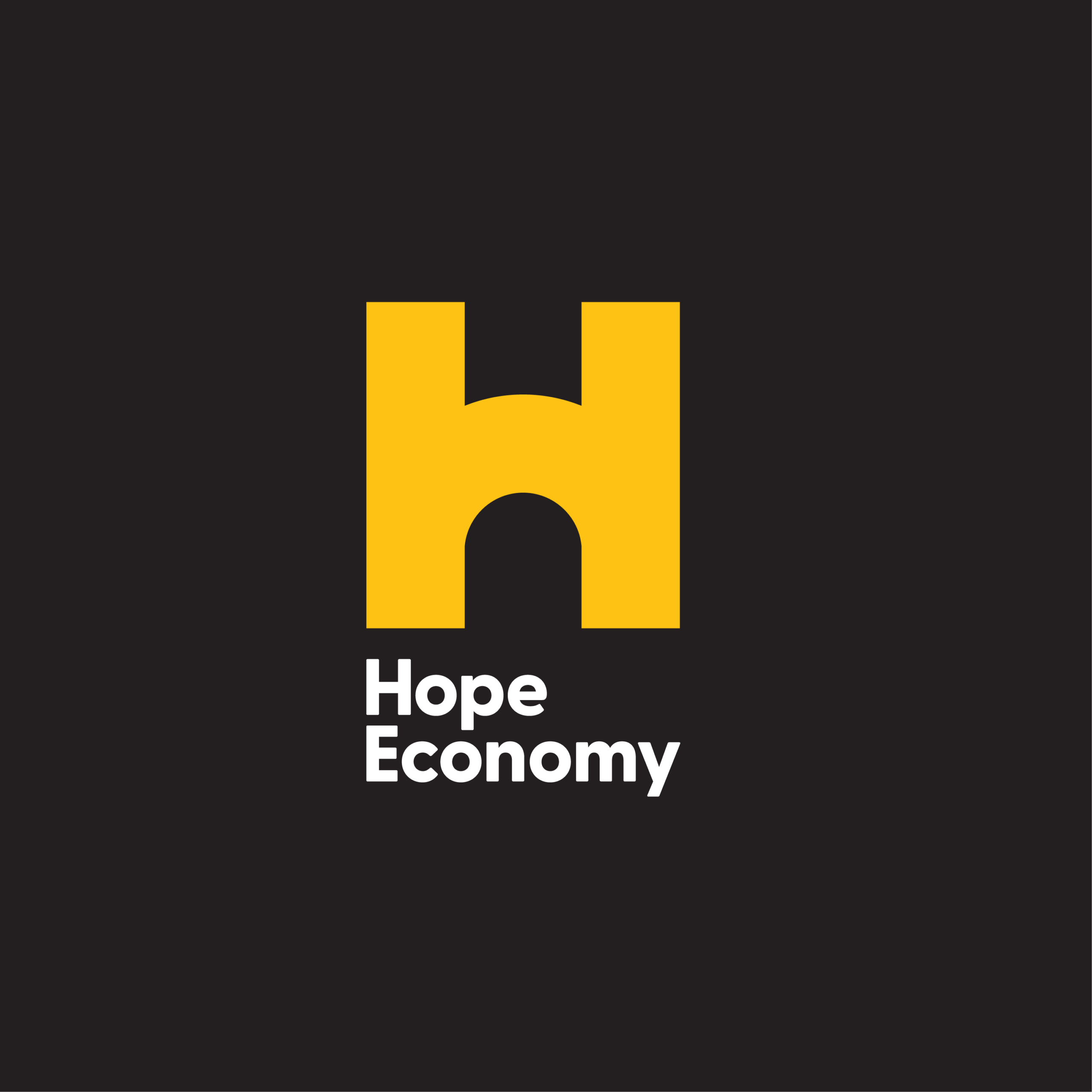
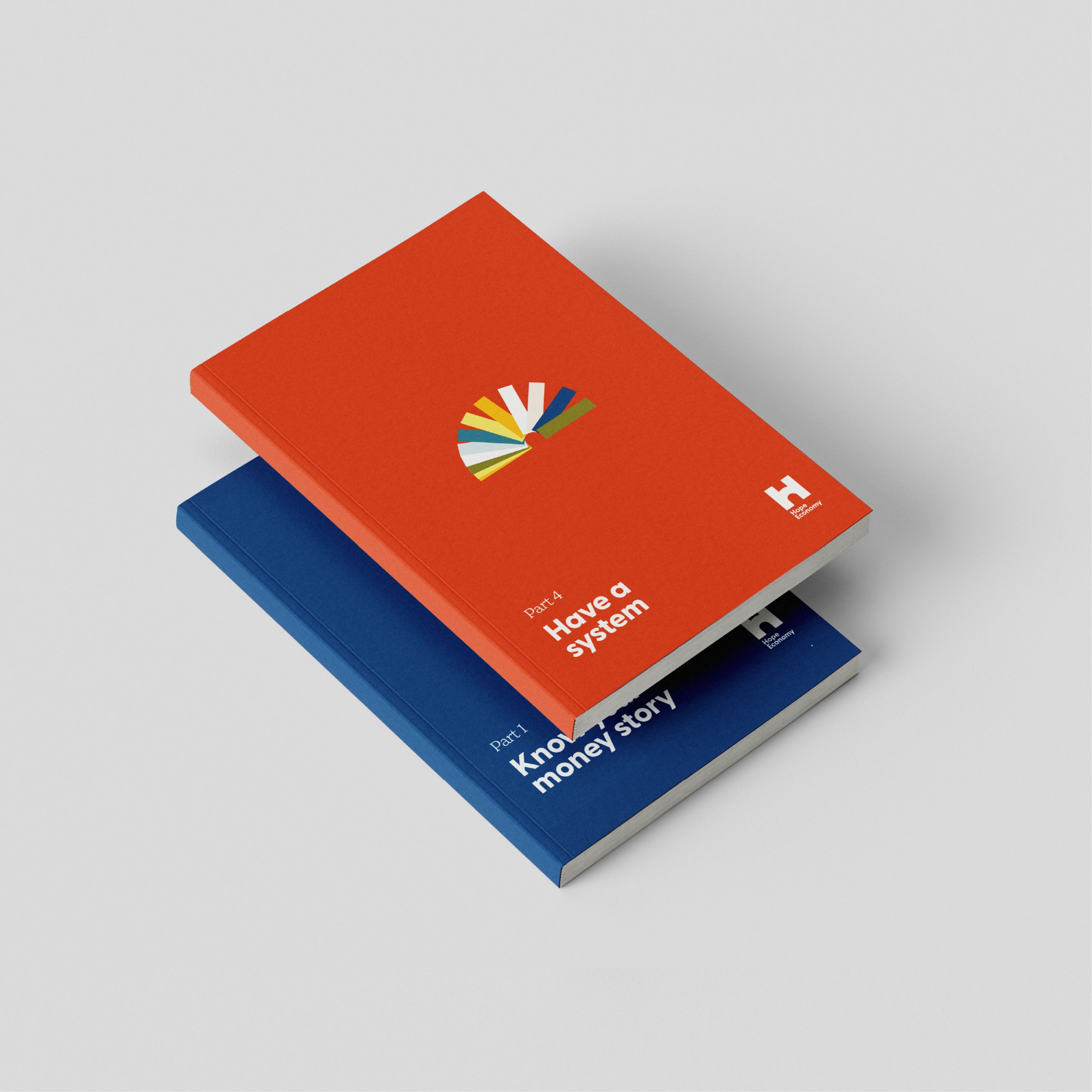
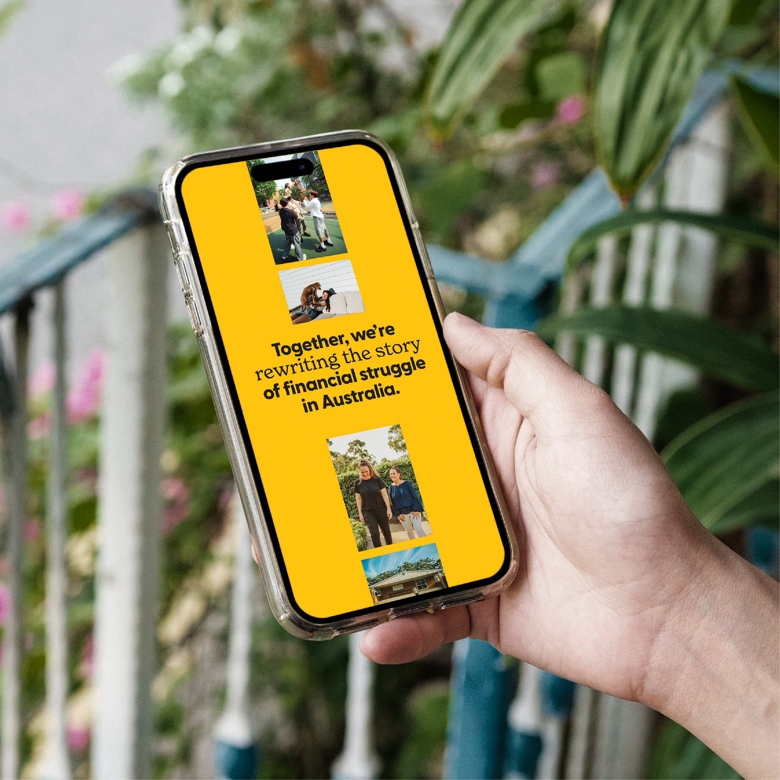
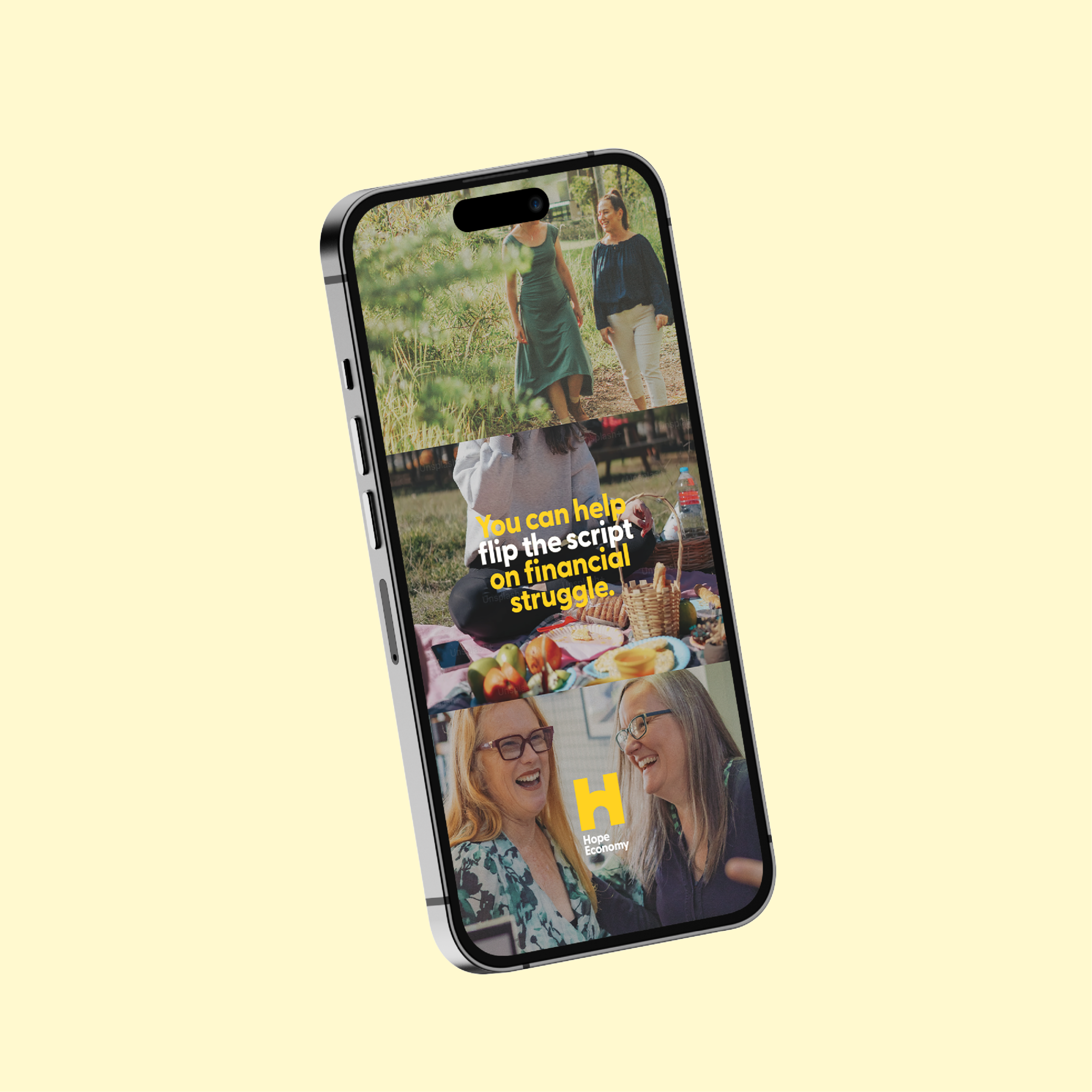
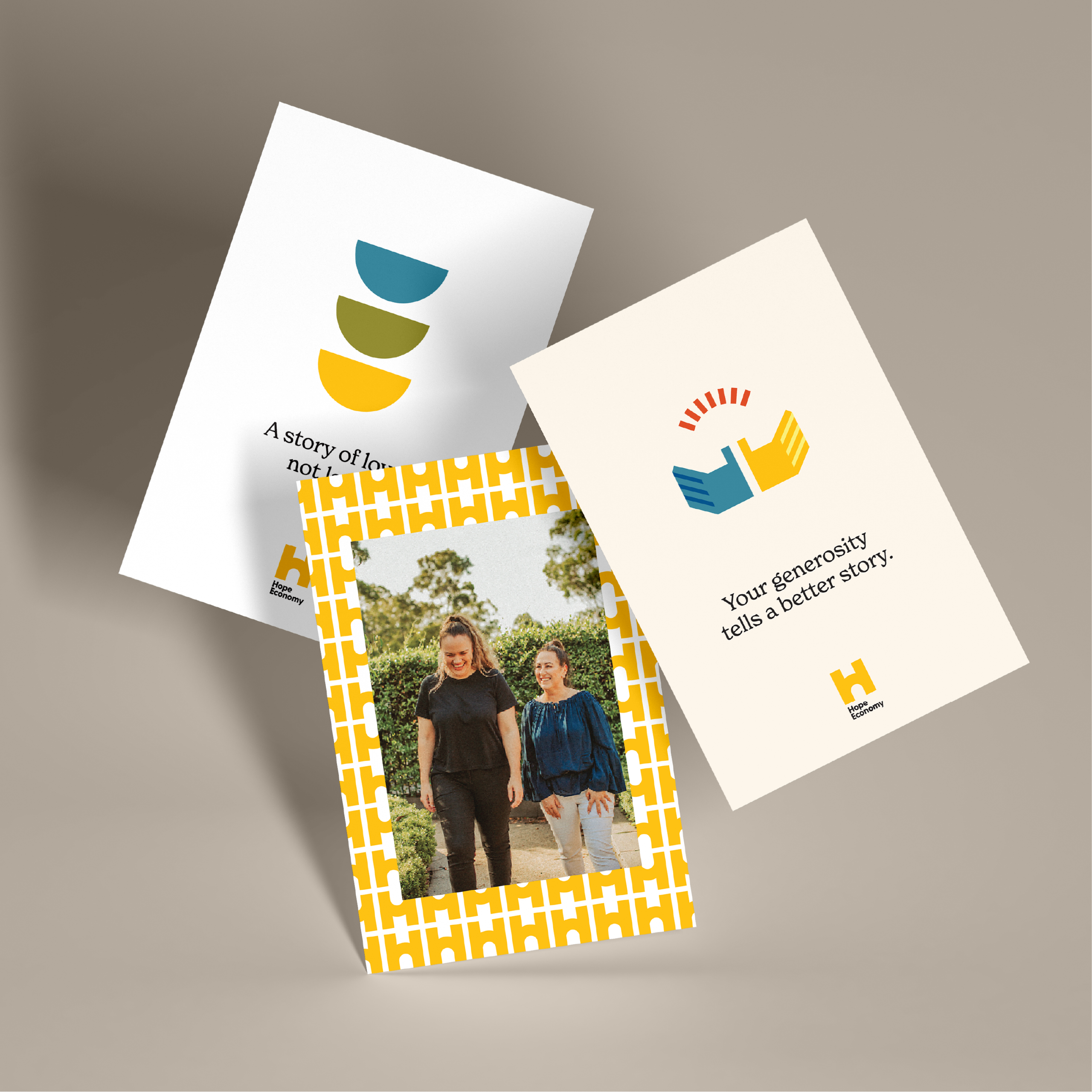
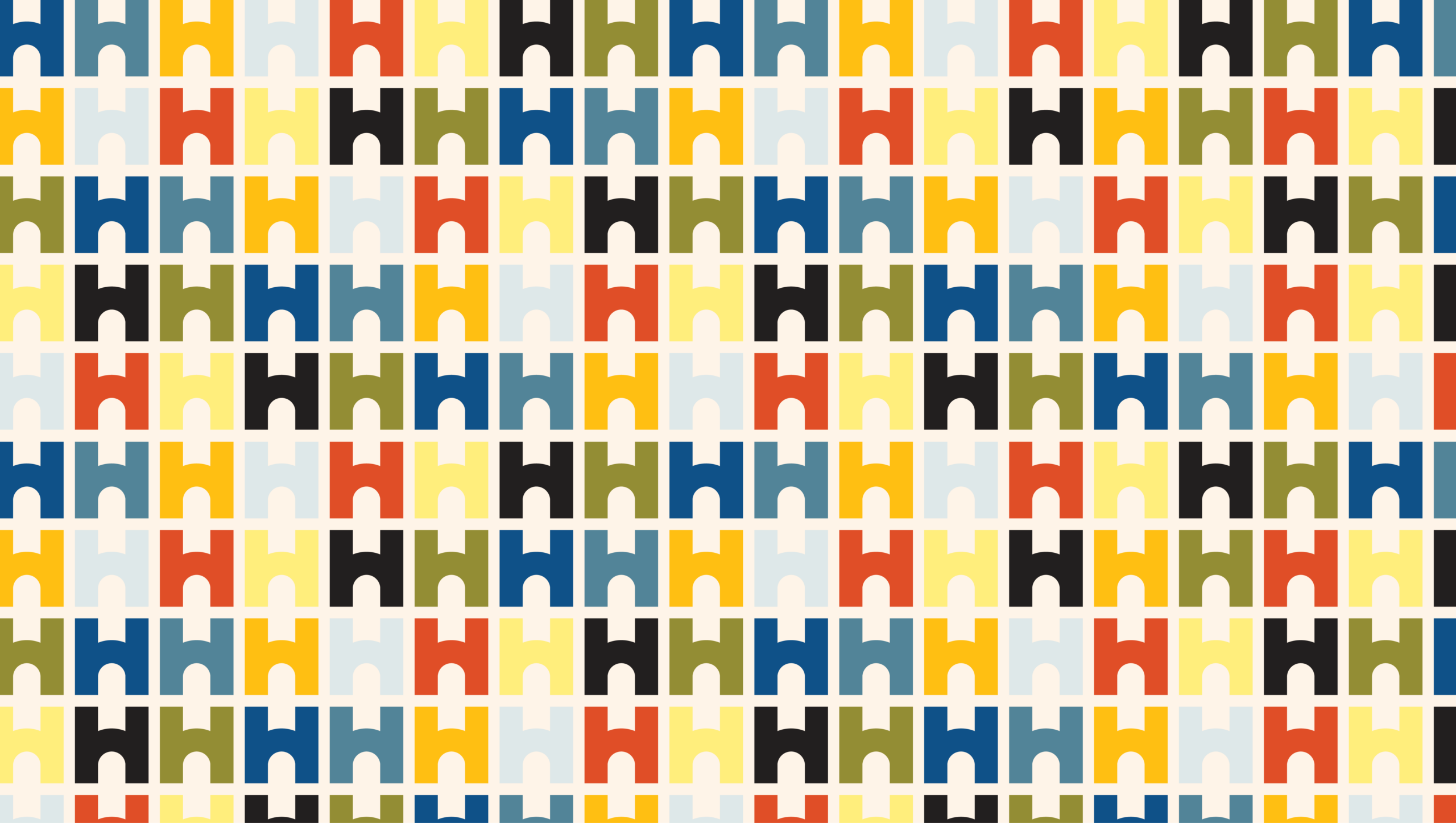
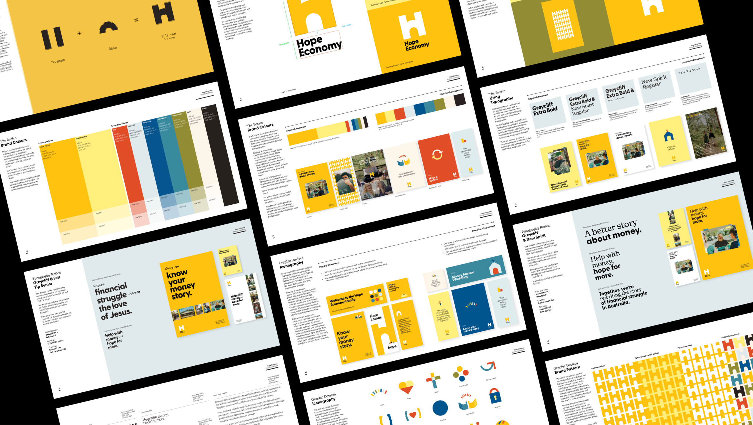
Hope Economy: New name, new brand, same mission
In early 2024, Christians Against Poverty (CAP) Australia partnered with Cadence for a major brand transformation. While the original brand was well-known, it no longer accurately reflected the organisation’s evolving mission. The challenge was to create a new name and visual identity that articulated their unique work while preserving the goodwill built over years of service. We developed a bespoke process that prioritised stakeholder input at every stage through workshops, surveys, and focus groups.
- Social and Public Welfare
- Faith-based
- Hope Economy
- Logo and Brand
- Visual Identity
- Brand Strategy
- Value Proposition and Messaging
- 2024 – 2026

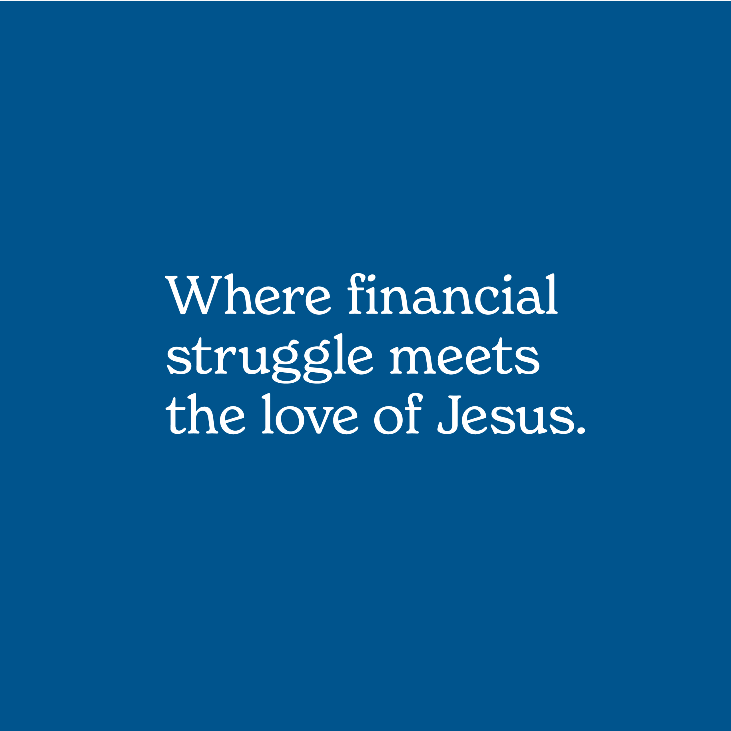

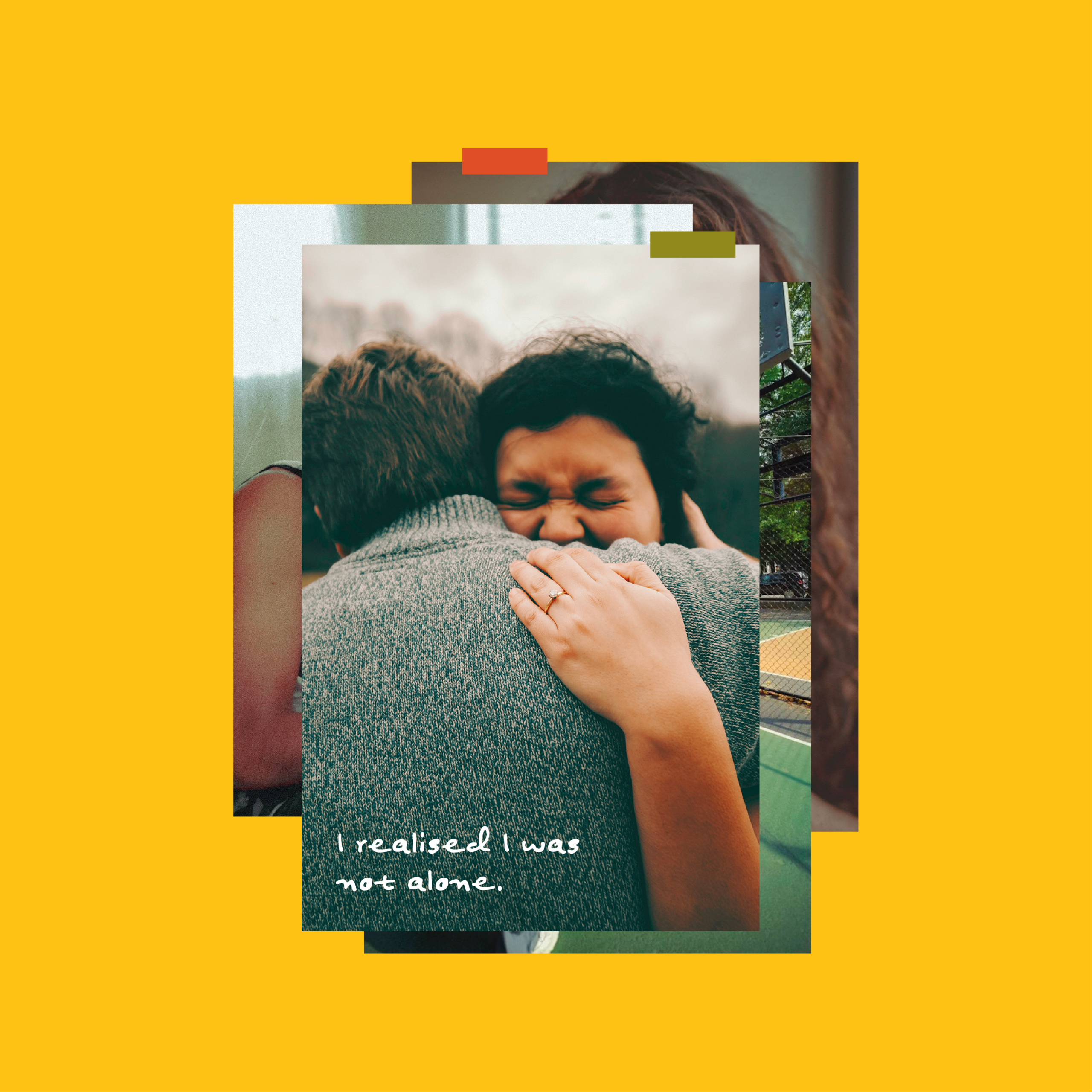
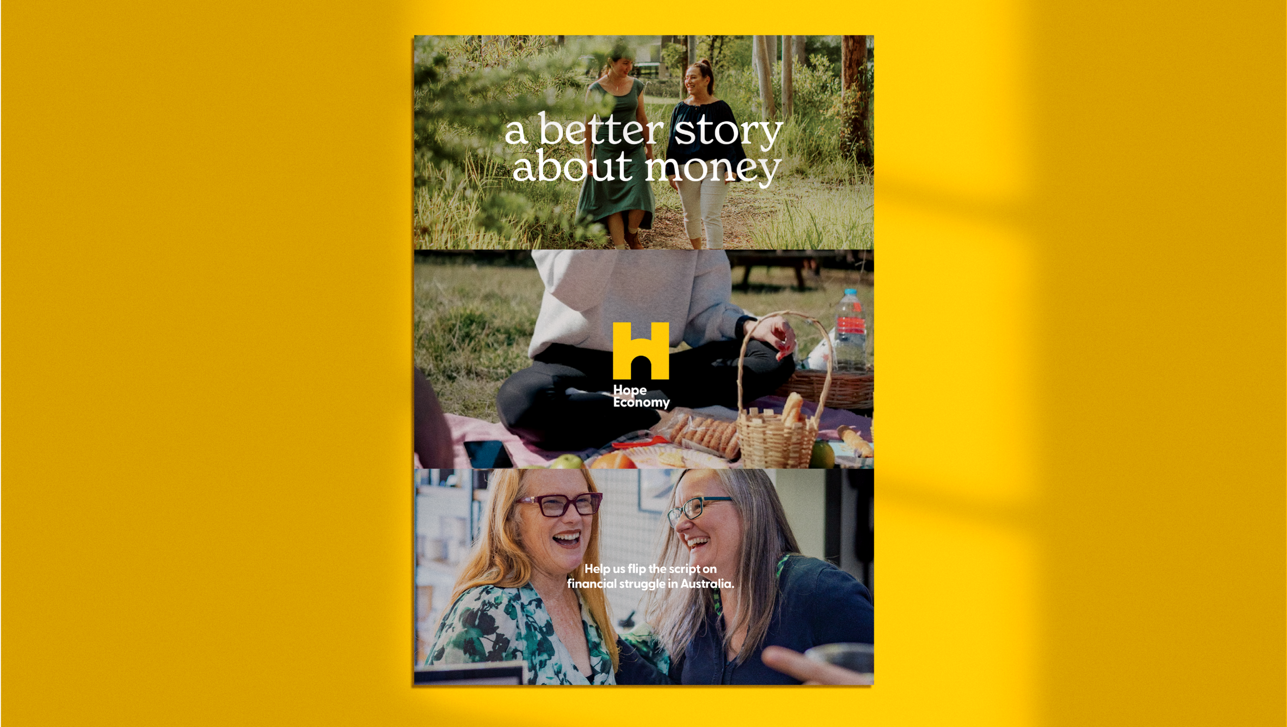
Moving from CAP Australia to Hope Economy was about more than just a name; it was about representing a thriving mission more authentically.
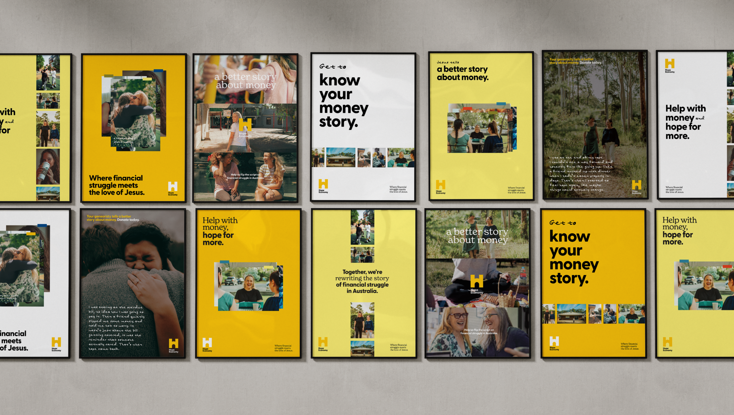
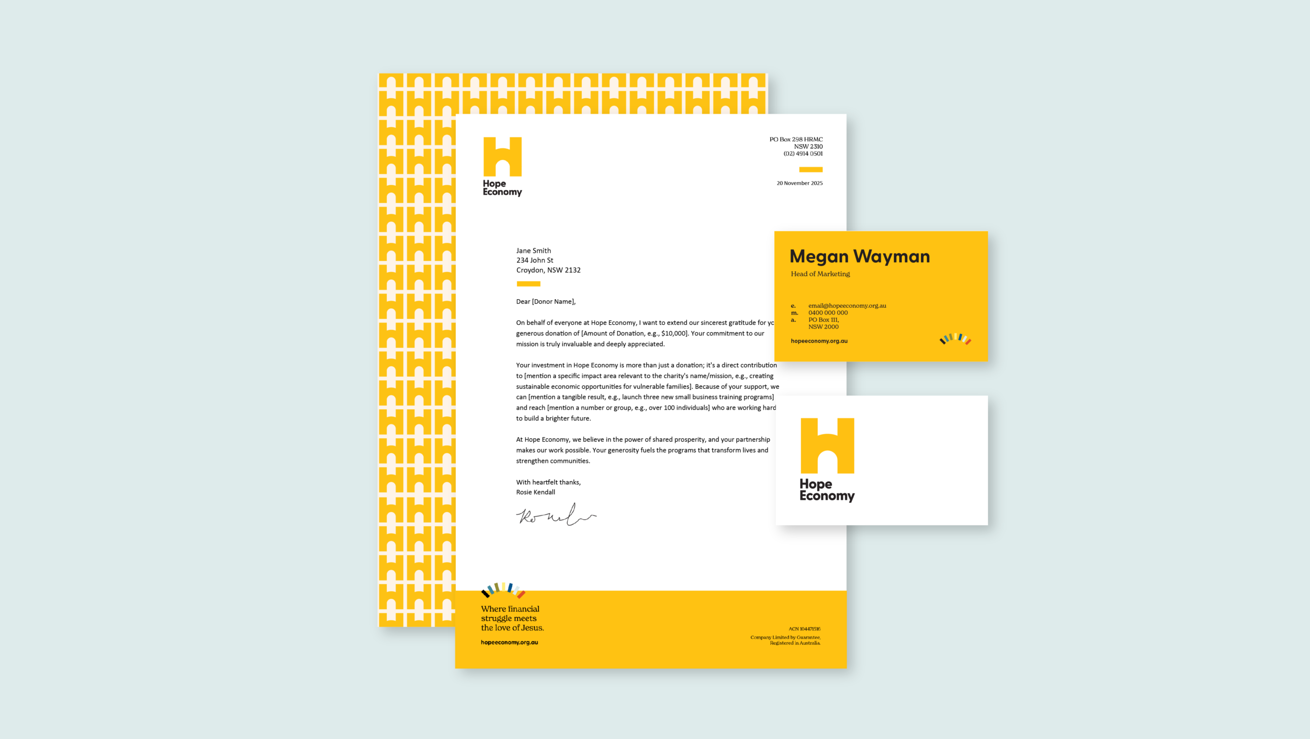
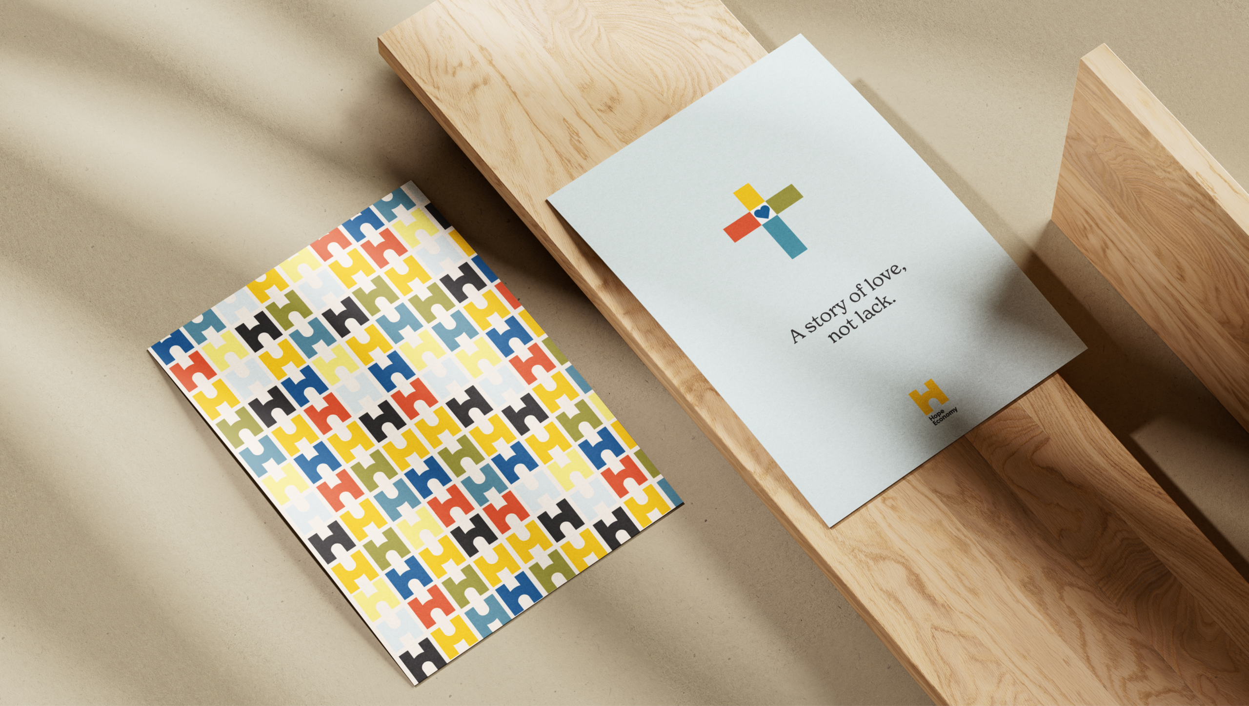
We’re proud to have helped build a brand that invites the Australian church to bring light and community to those facing financial struggle.
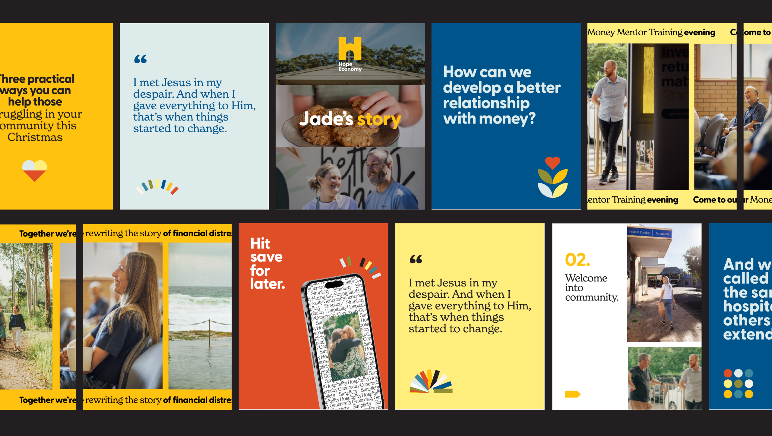
It was an honour to play a part in marking the next season of Hope Economy. Thank you to Nat for your support and assistance, we enjoyed this project so much.
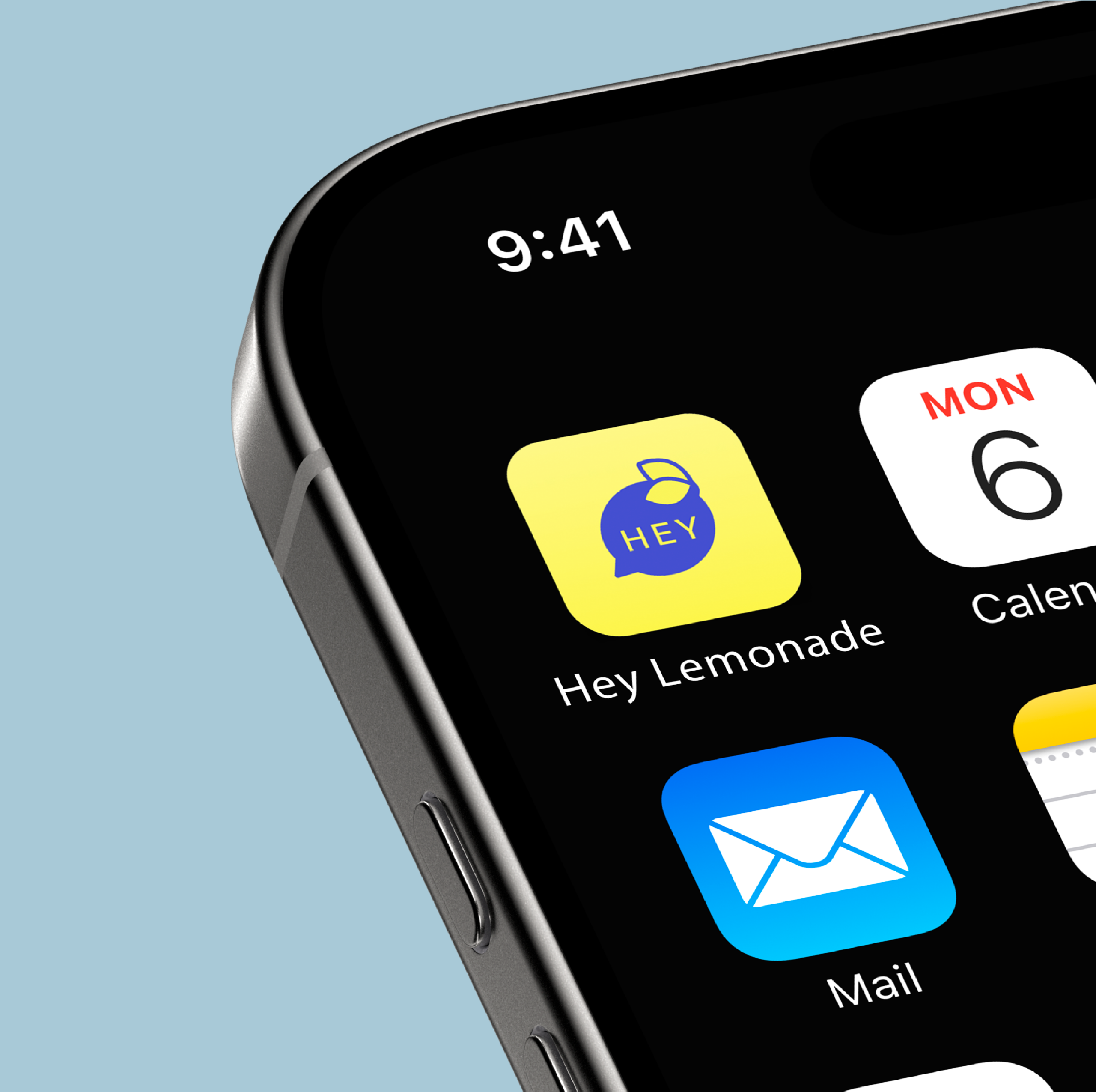
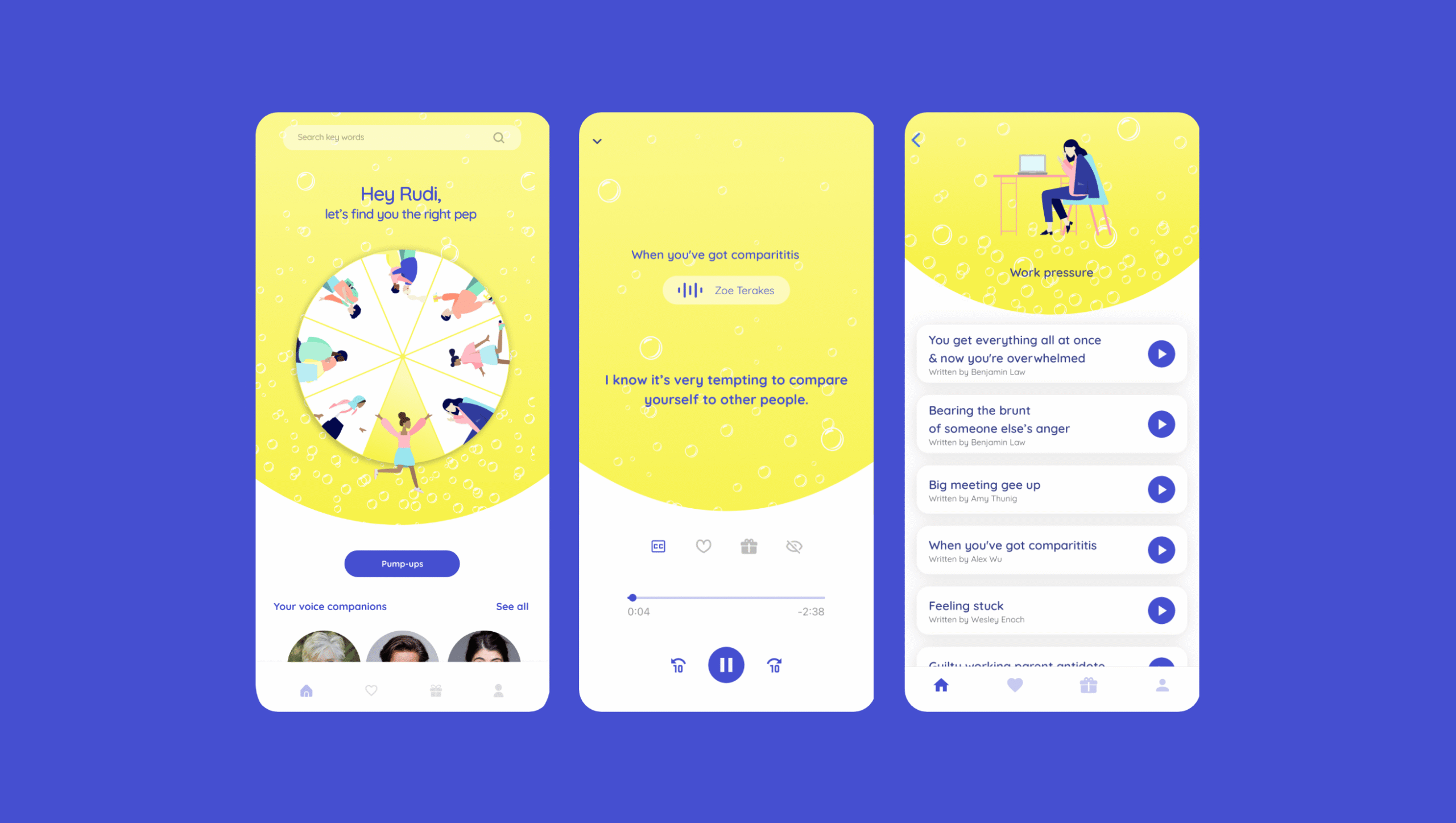
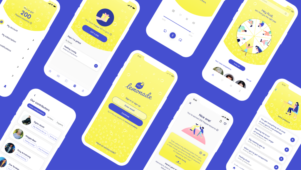
Hey Lemonade: Branding that pops
In 2020, Elise McCann and Lucy Durack, two of Australia’s most bright and bubbly performers, found their industries shut down. Determined to not get sour, they were on a mission to create a pep-talk style app to nip small stresses in the bud.
The idea was to use two-minute pep talks to bolster mental health in young people. They needed a brand that would engage young people in simple mental health practices, as well as appealing to large corporates who might add it to their EVP.
- Health and Wellbeing
- Hey Lemonade
- Brand Strategy
- Visual Identity
- Digital Design
- 2022
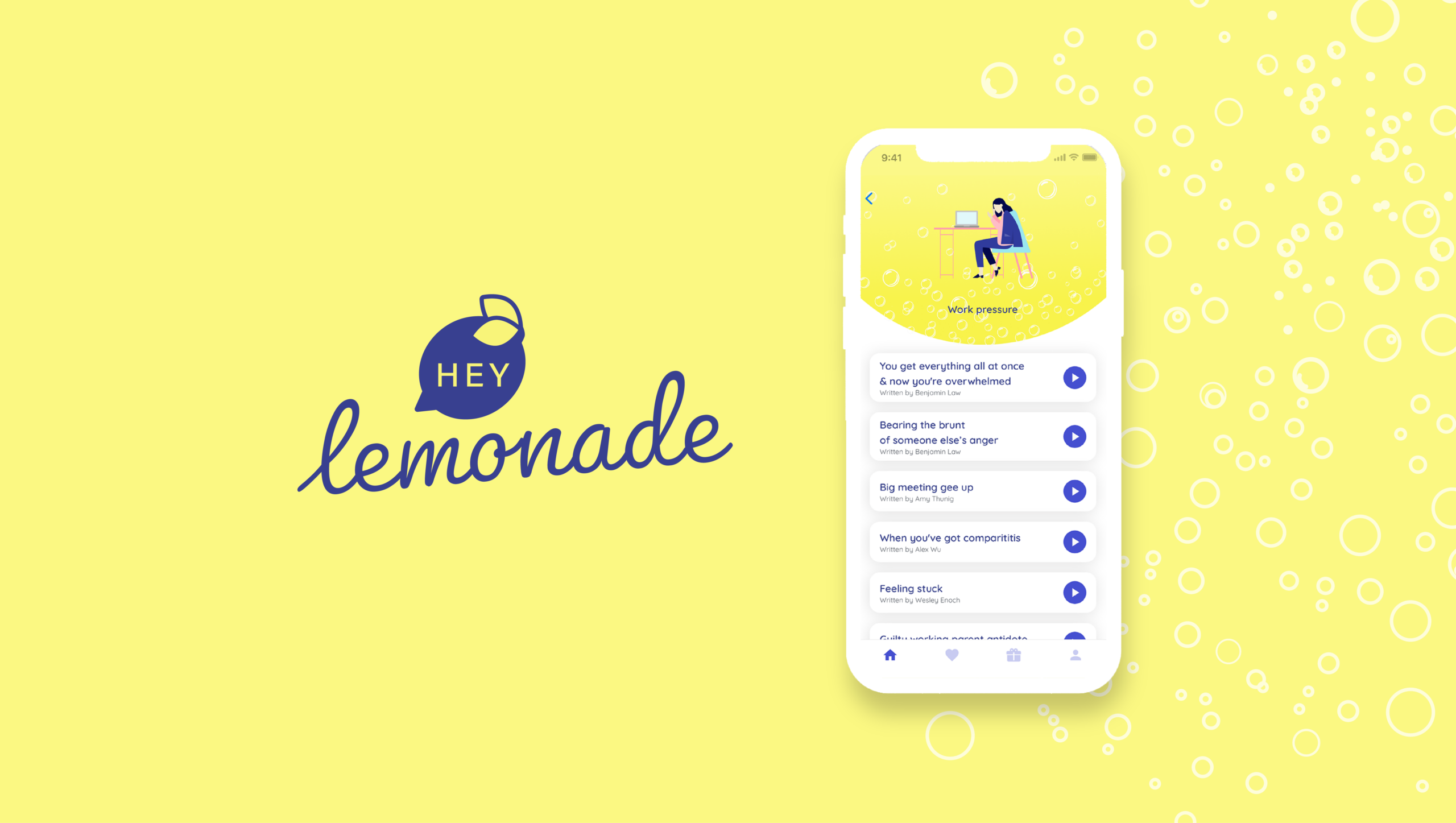
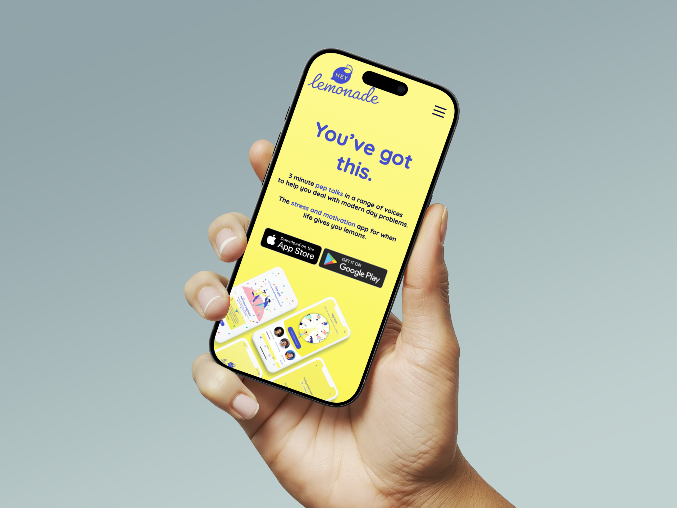
A full brand system, from mascot to co-branding, designed to engage young people and corporates alike.
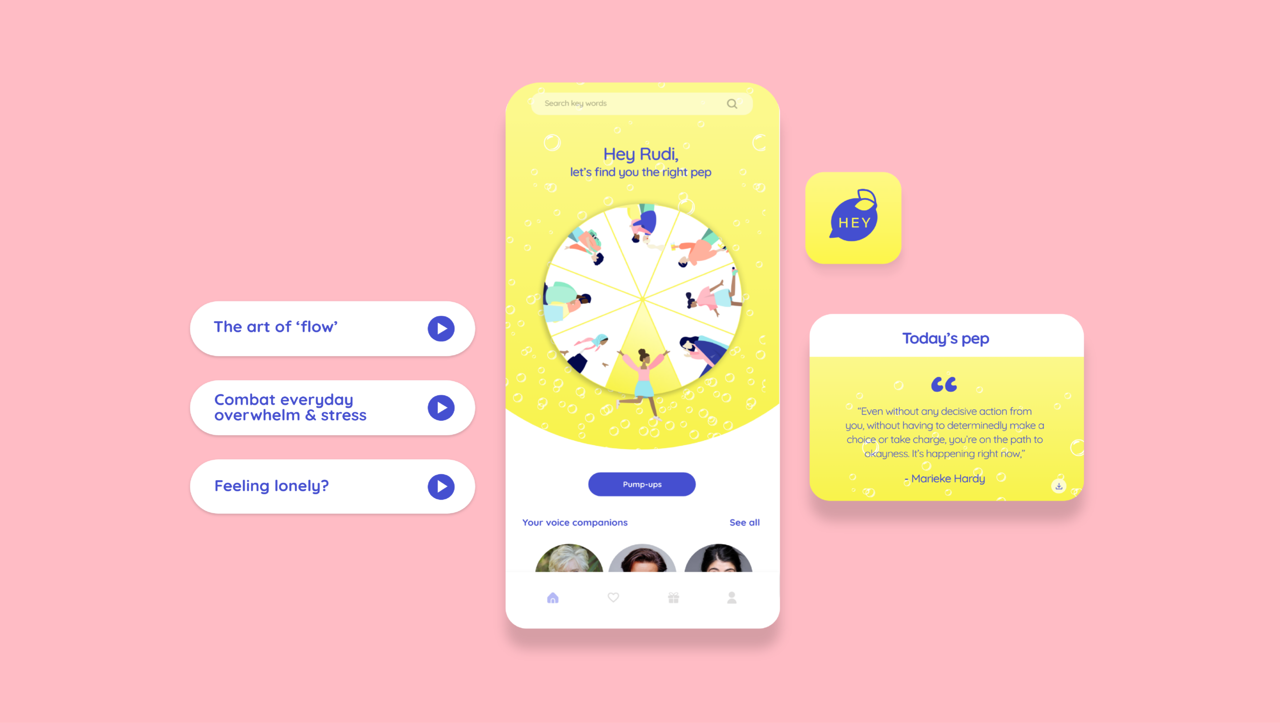
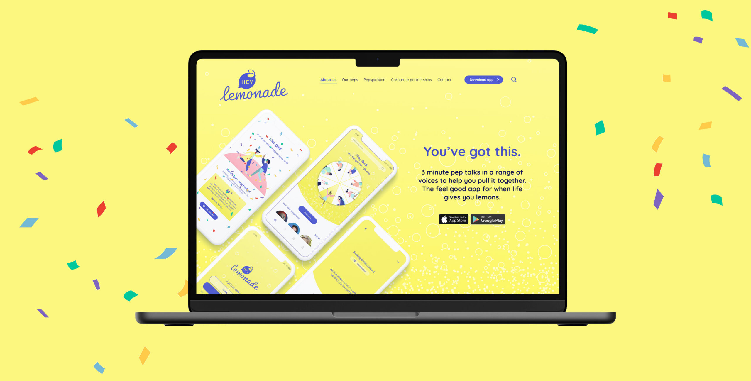
A fully integrated digital experience for Hey Lemonade, with user-focused interfaces and a scalable brand system across apps and platforms.

A big thank you to Elise and Lucy for welcoming us into bringing their idea to life. We are grateful to have played a part in hero-ing the importance of mental health in young people.

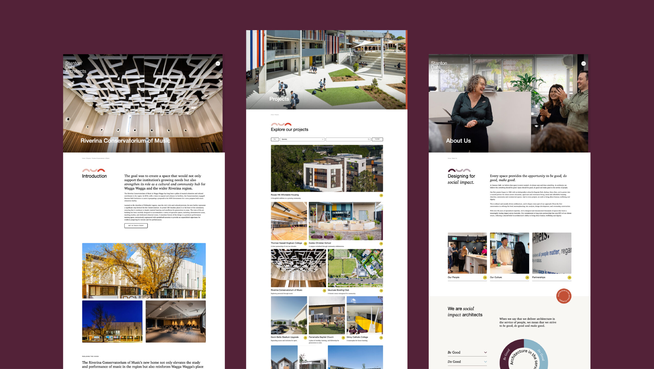
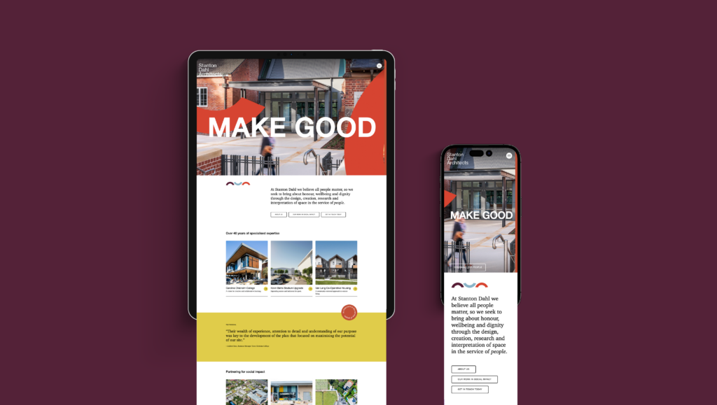
Stanton Dahl Architects: Web design that heroes building design
We were approached by Stanton Dahl Architects to design a bespoke web experience, focusing on their key messaging of ‘Designing for the greater good. We were required to use the existing brand elements and extend their messaging and visual identity further in a digital space. Designing a unique website for architecture was an appealing challenge. The website needed to be minimal enough to showcase the building projects, but have enough warmth and creative personality to stay true to their brand.
- Faith-based
- Education
- Aged care
- Stanton Dahl Architects
- Brand Identity
- UI Design
- UX Design
- Website Development
- 2024
We delivered a website that showcases their brand’s personality – by incorporating hero photography, stylised typography, playful graphic elements and pops of colour.

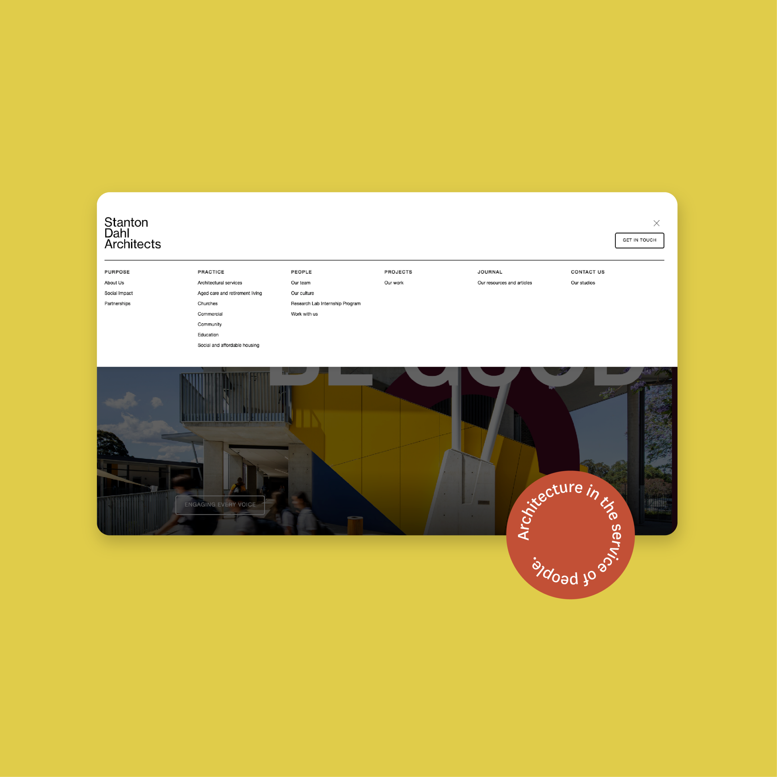
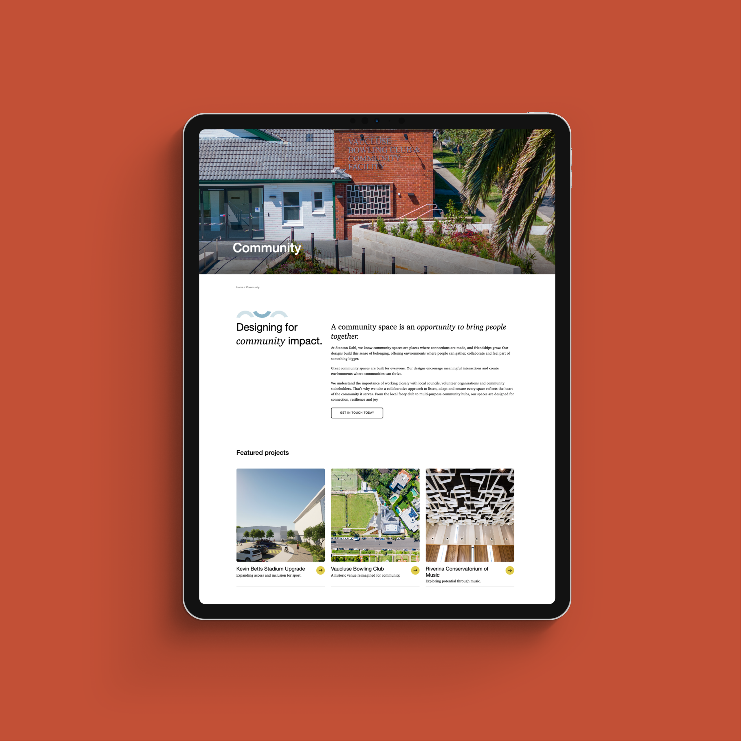
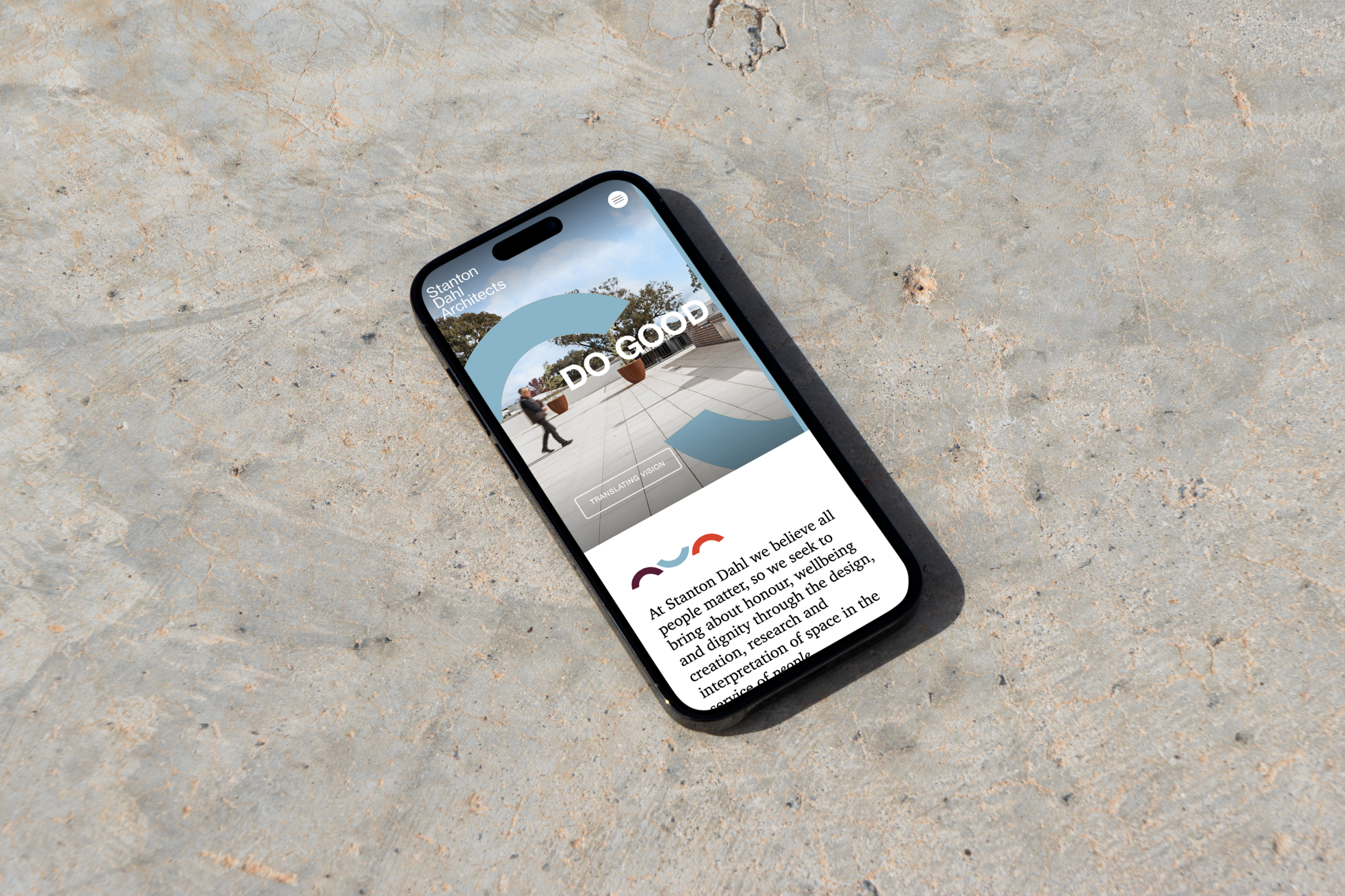
We needed to create a website that was equally minimal enough to highlight architecture, and bold enough to stay true to the Stanton Dahl brand.
It was a joy to work with Stanton Dahl on this bespoke website project, diving deeper into the architecture and community spaces industry. Shout out to Laura for her efficient project management between us and the Stanton Dahl team. We are incredibly thankful for her involvement in content collection and loading for the website.
→ See Stanton Dahl website here
Library for All: Web design for innovation and aid
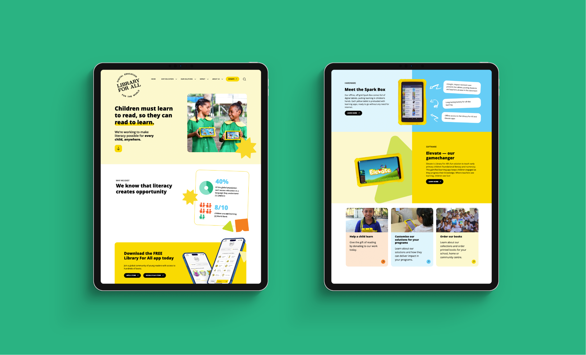
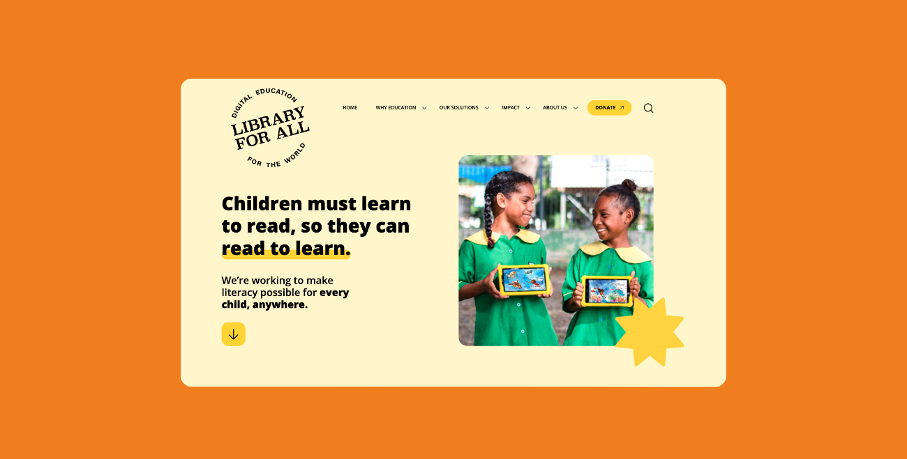
Library For All is on a mission to make sure every child can see themselves in the books they read. Their work is a beautiful, complex web of global authors, tech developers, and local communities. Our challenge was to take that complexity and turn it into a website that feels simple, inviting, and easy to navigate for everyone. We took their existing brand and evolved it into a vibrant digital world filled with bold colours and playful illustrations. By focusing on the Why, What, and How, we made it easy for stakeholders to understand their impact at a glance. The result is a site that is as innovative as the apps they build and as joyful as the stories they tell.
- Aid and Development
- Education
- Children's Charity
- Library for All
- Web Development
- UI Design
- UX Design
- 2023

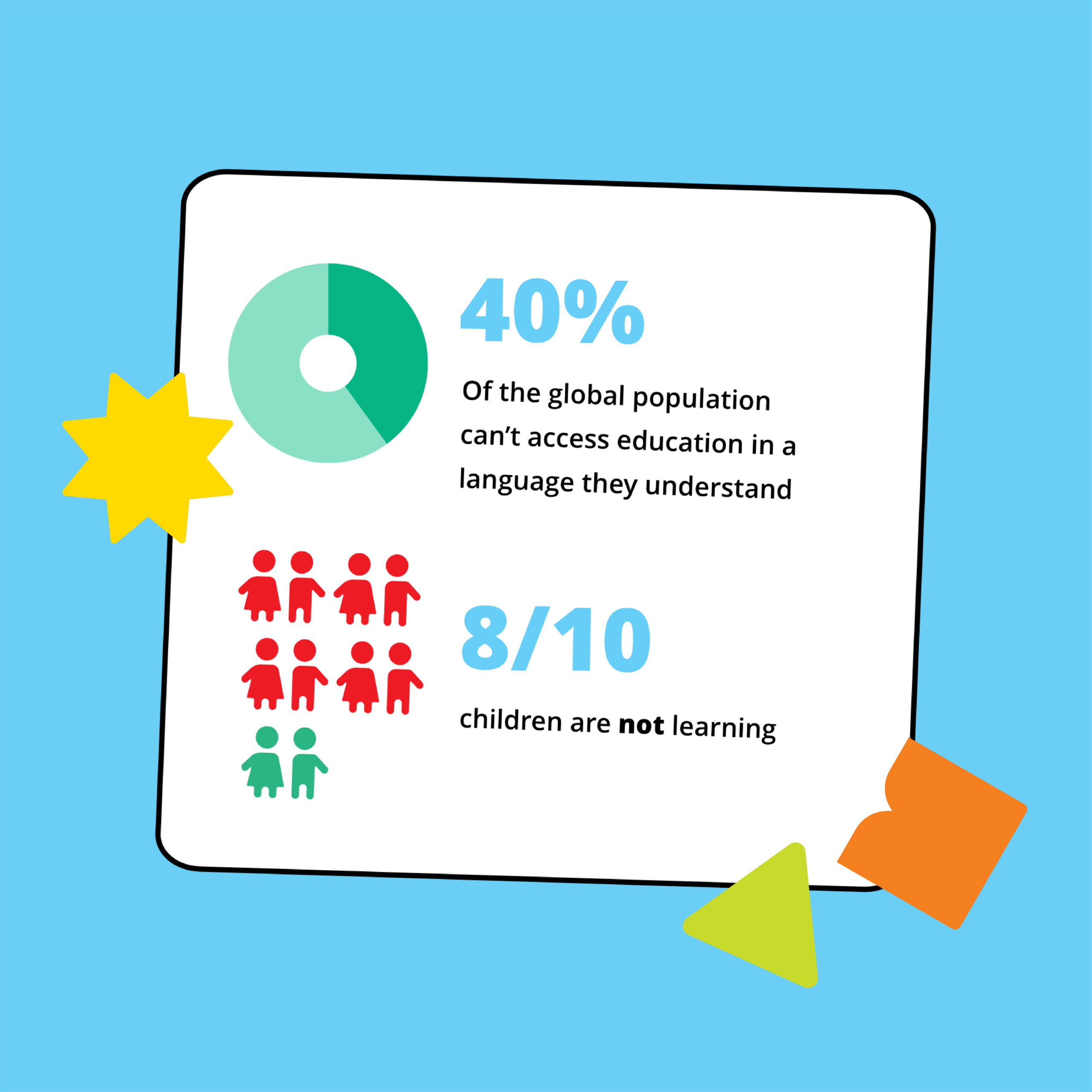
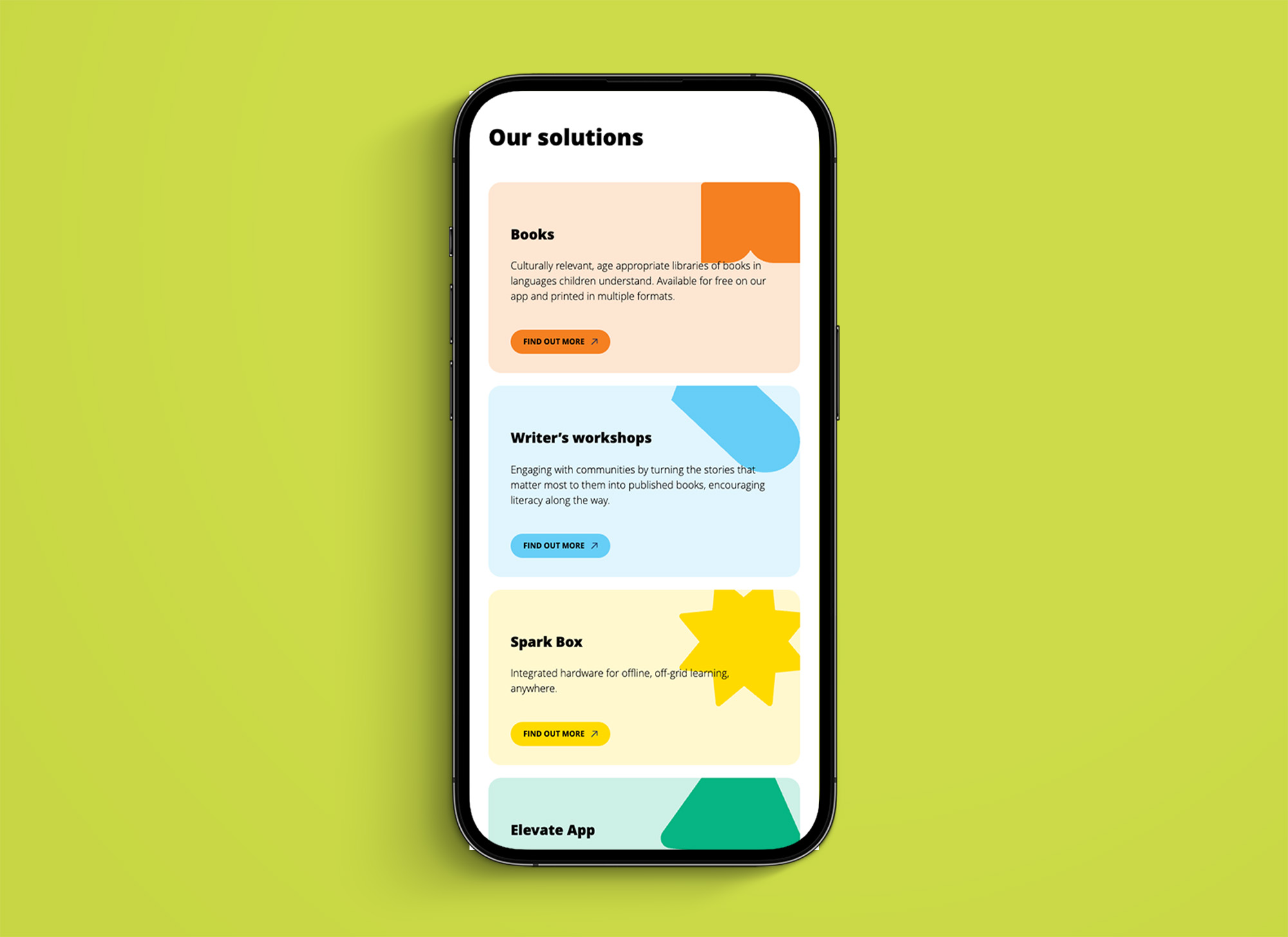
Our challenge was to put the amazing child-friendly design and innovation of their hardware and apps in front of their financial partners and supporters through their web experience.
Thank you to Library for All for inviting us in on this project and for being open to adopting a new distinct design direction! It was fun to bring some of the joy and fun from your app built for kids – to your organisational branding.
→ See Library for All website here
Explore more good stuff.
AUCD: Animated explainer for a university college
The Australian University College of Divinity (AUCD) faced a complex communication hurdle: explaining the relationship between a central “University College” and its diverse, autonomous member colleges. We delivered a cinematic explainer that serves as both an invitation and an educational tool for potential member colleges.
- Education
- Faith-based
- Australian University College of Divinity
- Illustration
- Videography
- Animation
- Scripting
- 2025
Our solution was to base the film on the metaphor of a vast and colourful tapestry – where an animated ‘thread’ visually weaves together the stories of each unique college into one unified picture.
Transitioning between the “animated world” and curated footage, we were able to illustrate the “common thread” of AUCD’s support without requiring on-site filming at every individual campus.
We are grateful to the Australian University College of Divinity for trusting us to interpret their rich institutional history through this creative lens. It was a joy to help synthesize their complex structure into a beautiful, cohesive narrative. We also thank the various colleges within the AUCD collective whose diverse missions provided the “threads” for this story, allowing us to showcase the breadth and beauty of theological education in Australia today.
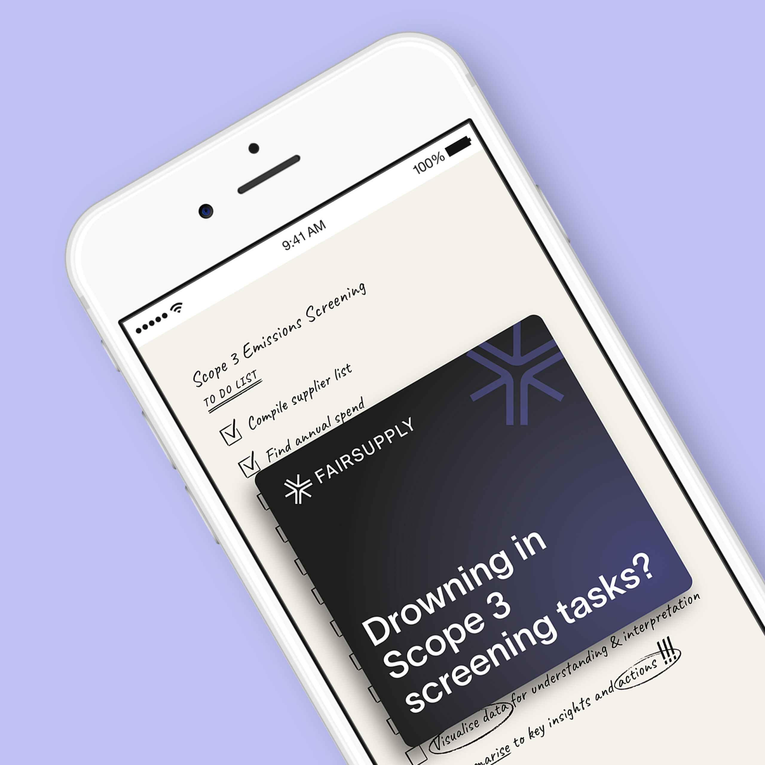
Fair Supply: Print ads that make you stop
With new mandatory reporting standards that began on January 1st 2026, Australian boards faced a massive data challenge: greenhouse gas disclosures are no longer optional. We partnered with Fair Supply to launch a high-impact print campaign in the Australian Financial Review, as well as a digital campaign, positioning them as the essential partner for navigating this complexity. Our challenge was to cut through the noise and show leaders that while Scope 3 reporting is notoriously difficult, Fair Supply can deliver audit-ready results in weeks, not months.
- Social Enterprise
- Human Rights
- Responsible Investing
- Fair Supply
- Marketing Strategy
- Editorial and Print
- 2025
Our goal was to cut through the noise of a new regulatory landscape and show boards that compliance doesn’t have to be a manual burden.
We built the creative around the ‘coming iceberg’ of emissions reporting, using bold print ads and animated digital ads to point company executives to what a defensible report actually looks like.
We love working with Fair Supply in their efforts to help for-profit organisations to be a force for good in the world. The impact that large corporations can make by factoring their emissions, modern slavery and biodiversity footprint into their supply chain decisions is immense.
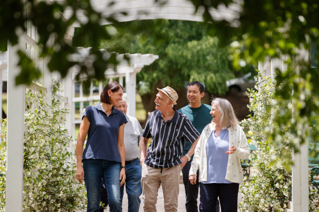
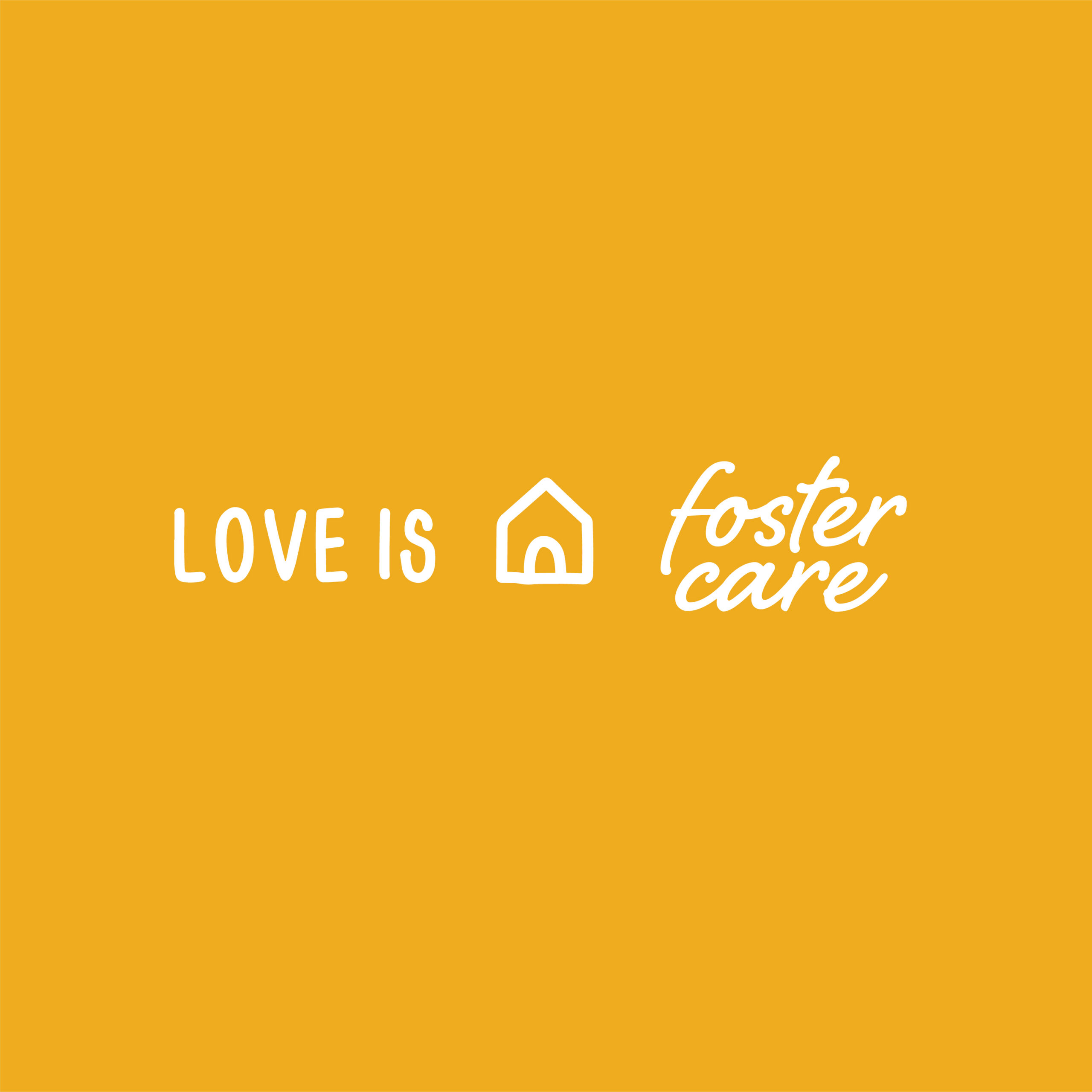
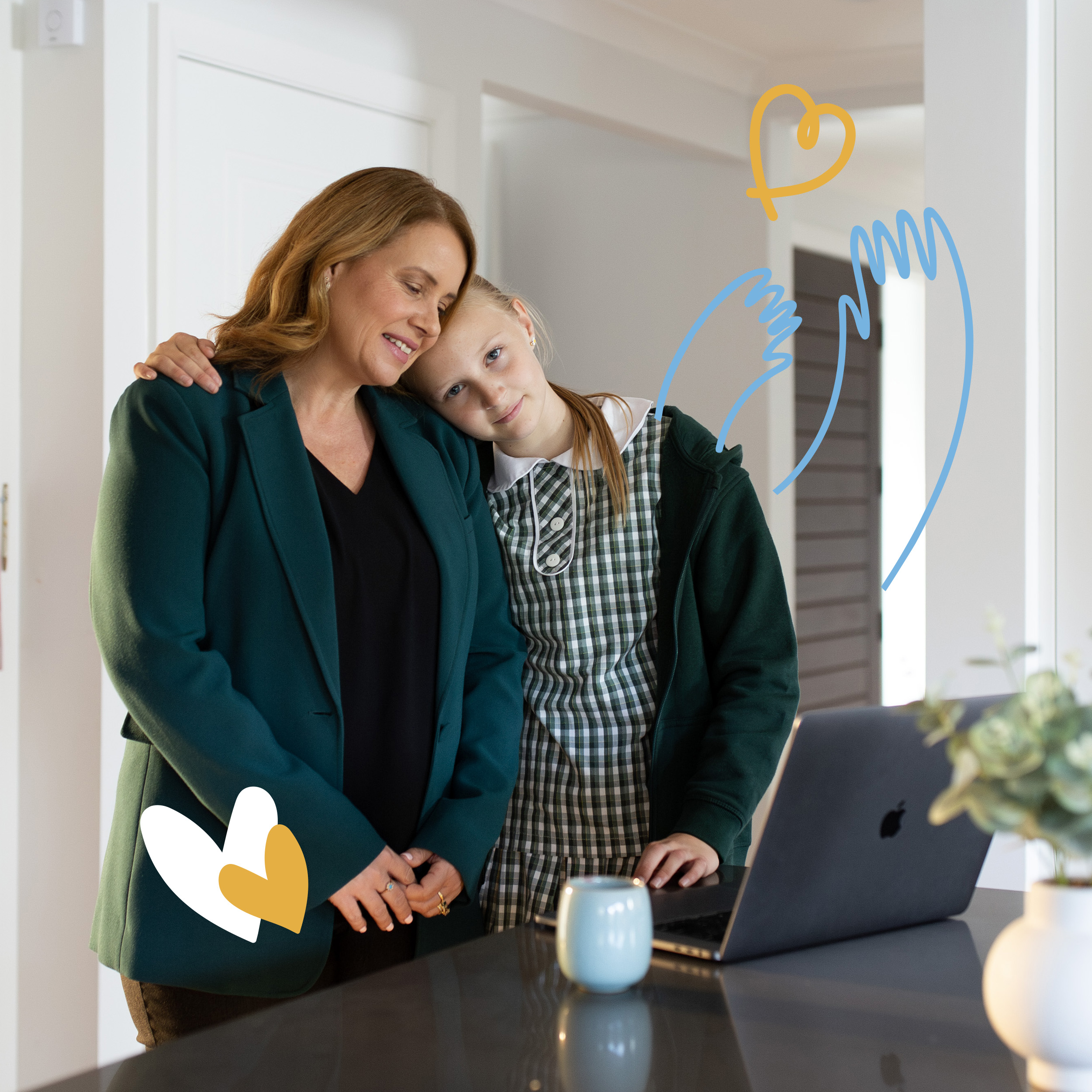
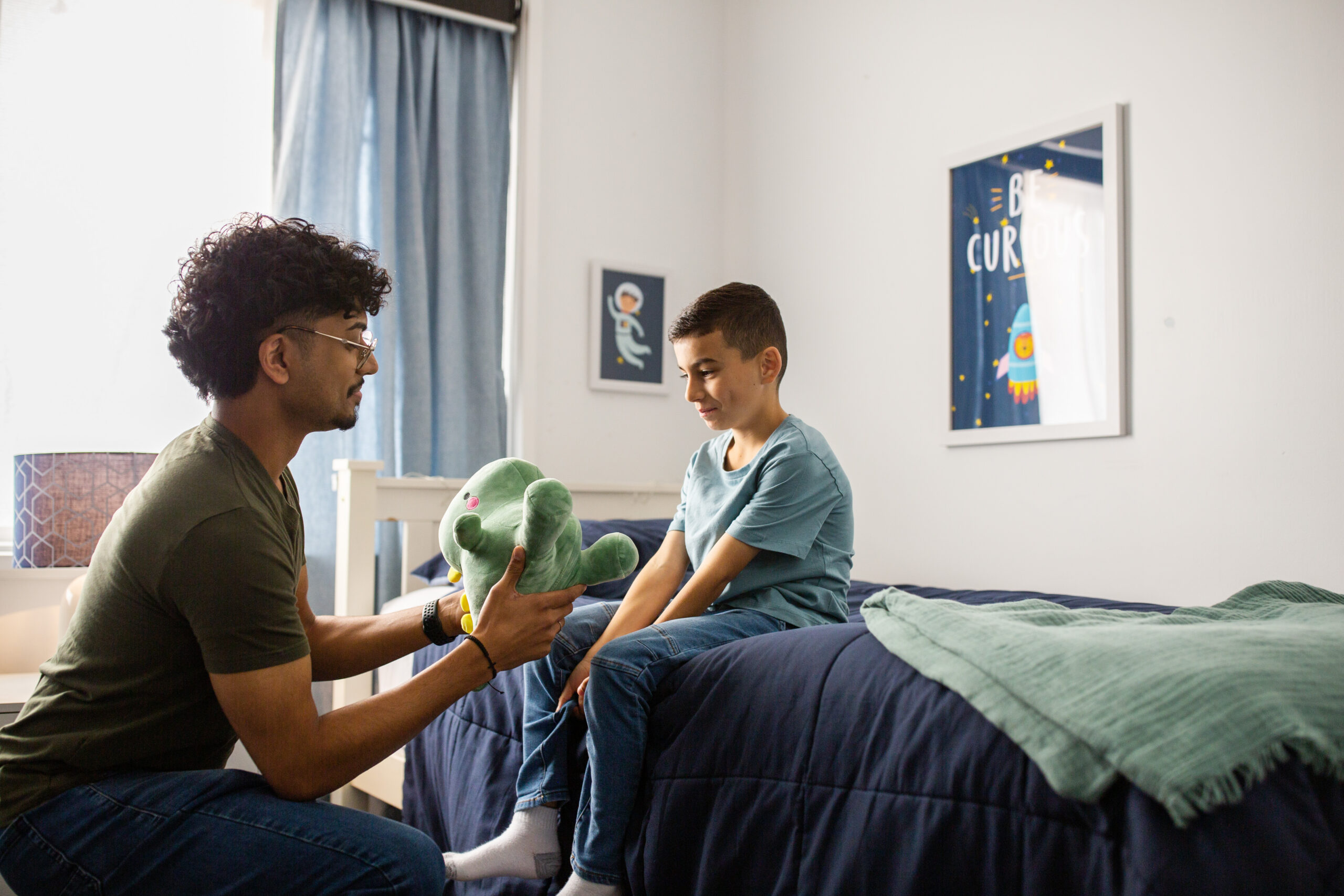
Anglicare: Love is Foster Care
Every week, Anglicare receives more than 100 requests to provide a safe home for a child in crisis. Yet it is still so hard to find good homes and families to care and love these kids. We worked with Anglicare to develop a campaign that would reframe foster care in our audiences minds – from fear to empowerment. We wanted to show the beauty, the possibility, and the challenge that comes from loving a child who needs it.
- Purpose Driven
- Social and Public Welfare
- Anglicare
- Brand Strategy
- Visual Identity
- Videography
- Editorial and Print
- 2023
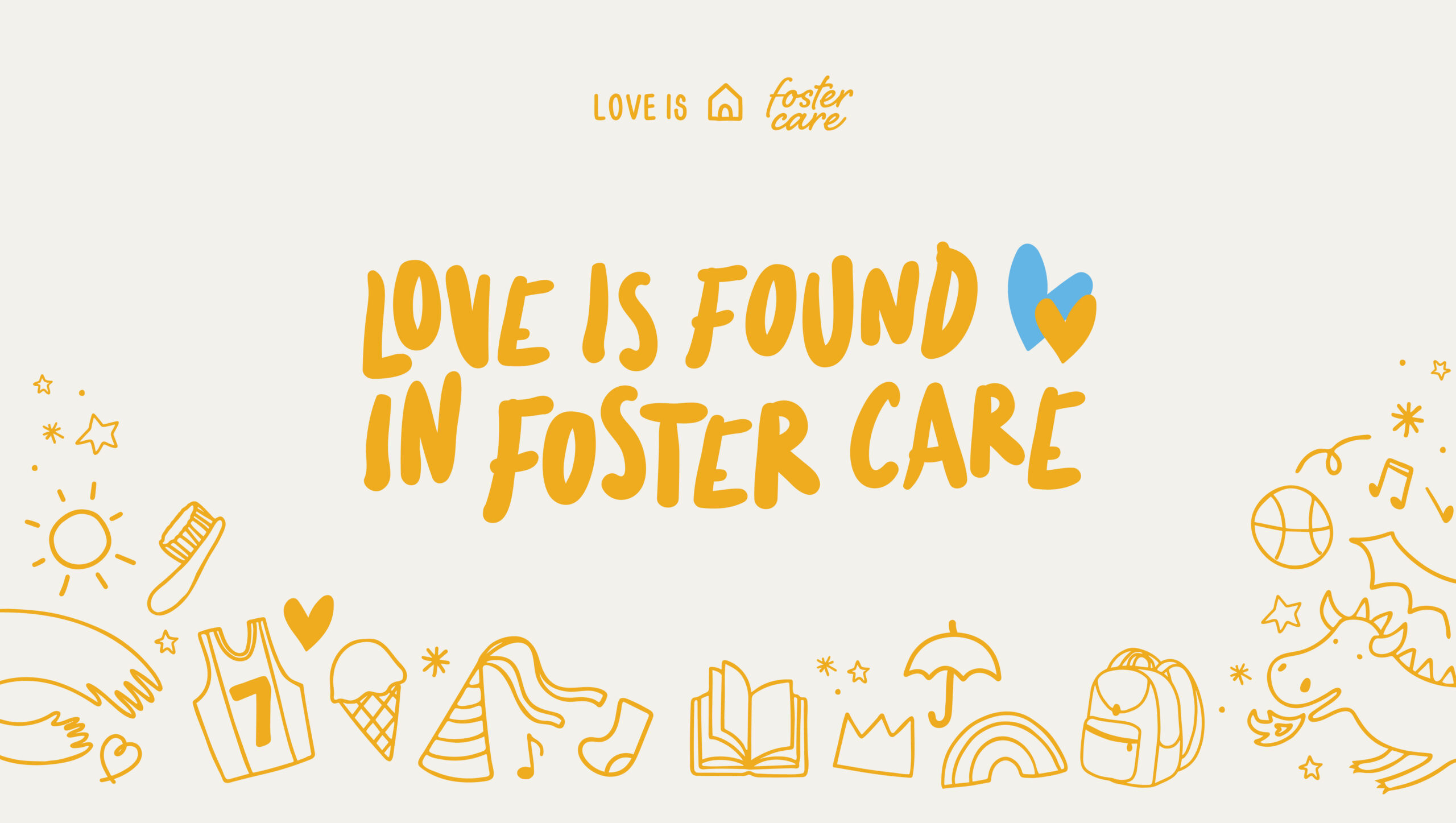
We worked with Anglicare to develop a campaign that would reframe foster care in our audiences minds – from fear to empowerment.
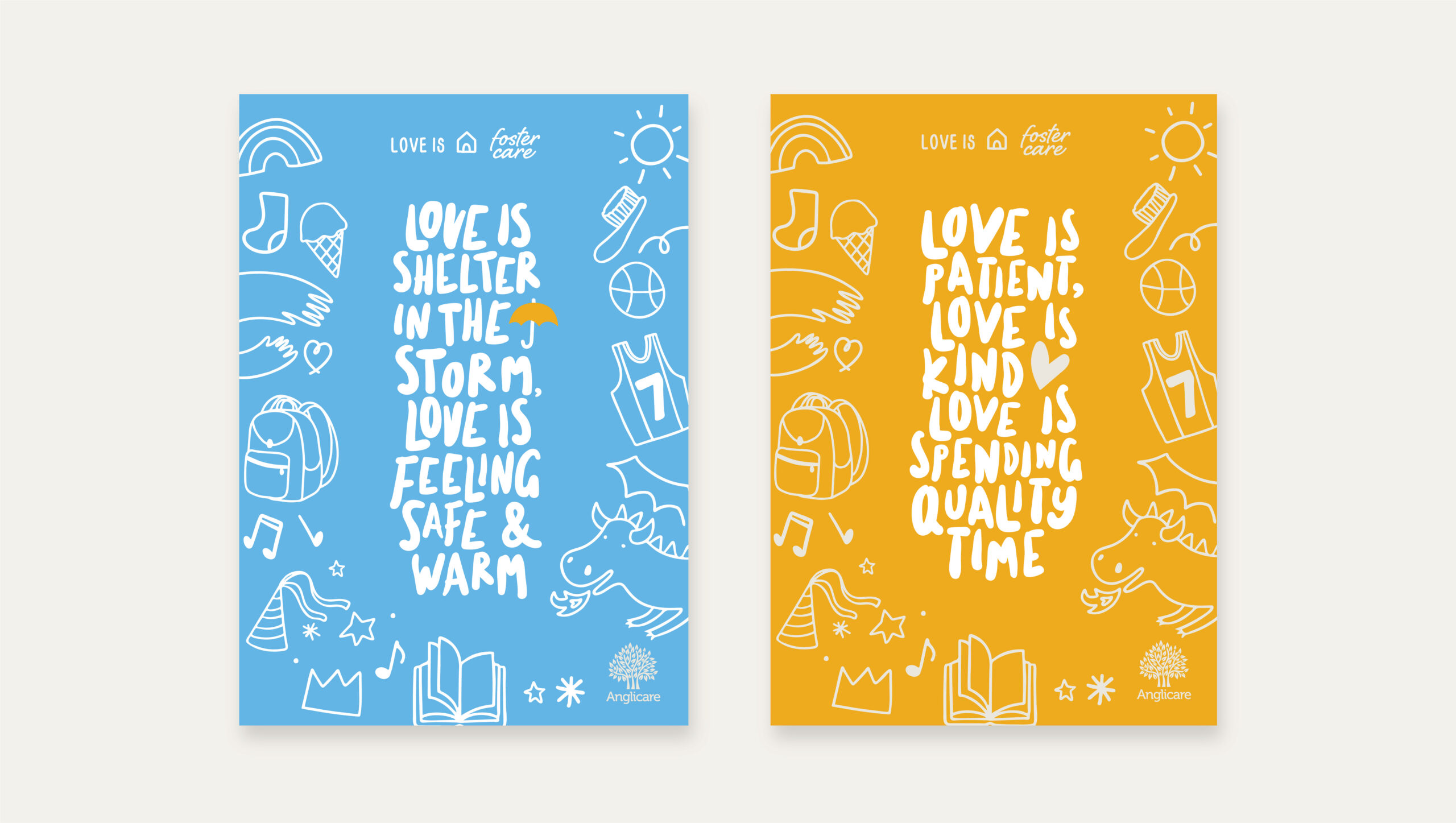
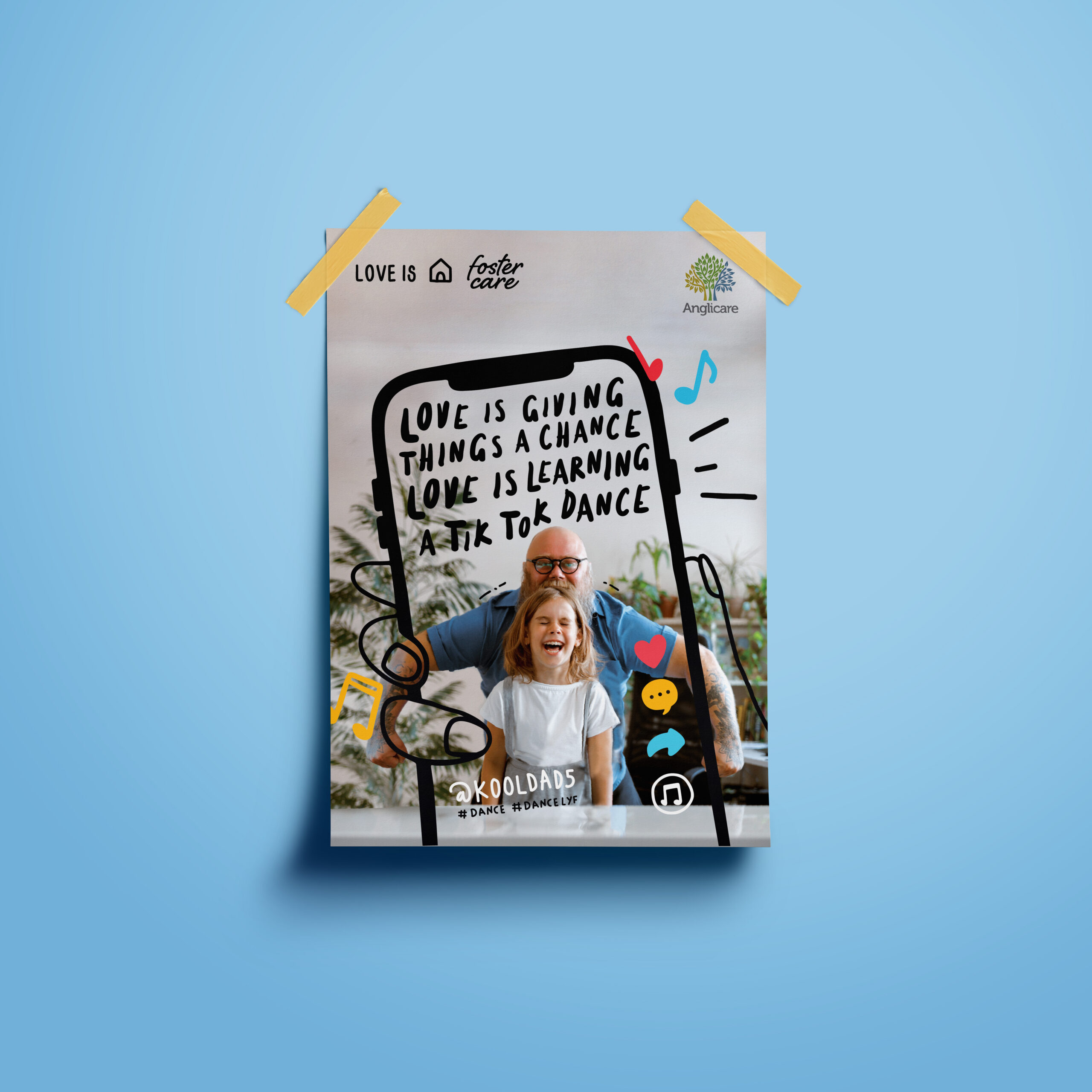
Love is patient, love is kind. Our messaging captures this call to love, showing that foster parents need not be experts, they just need to know how to love.
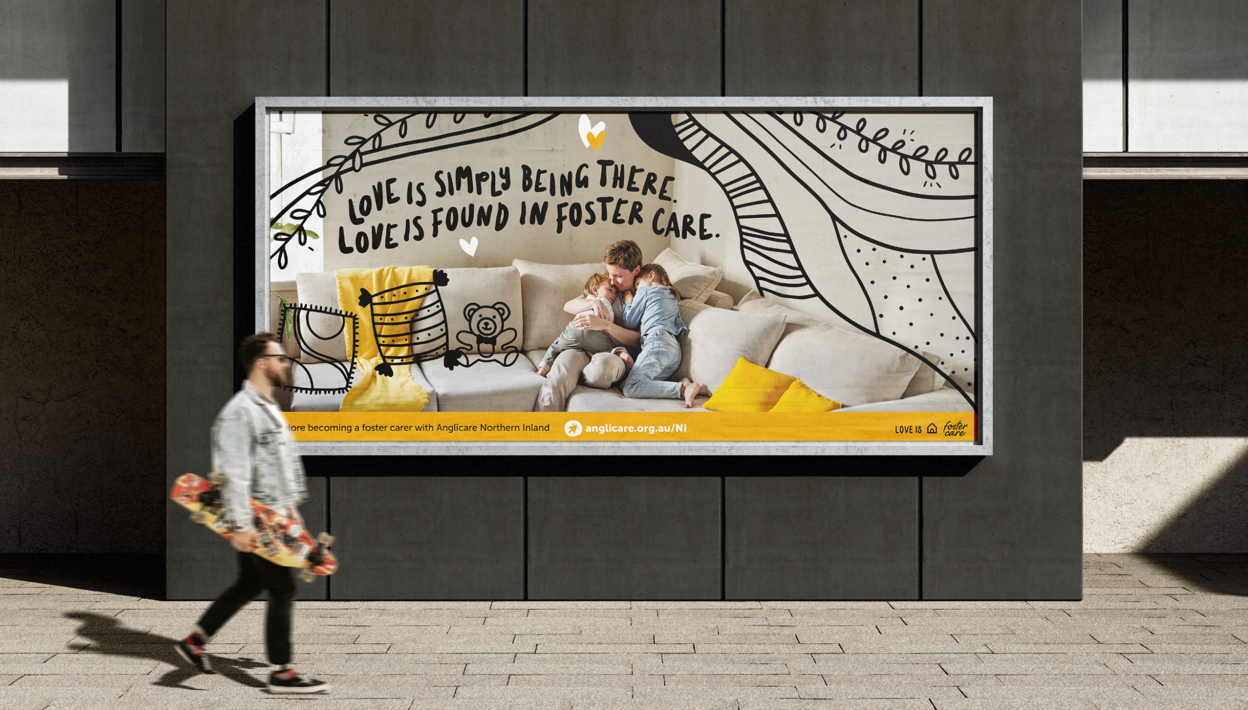
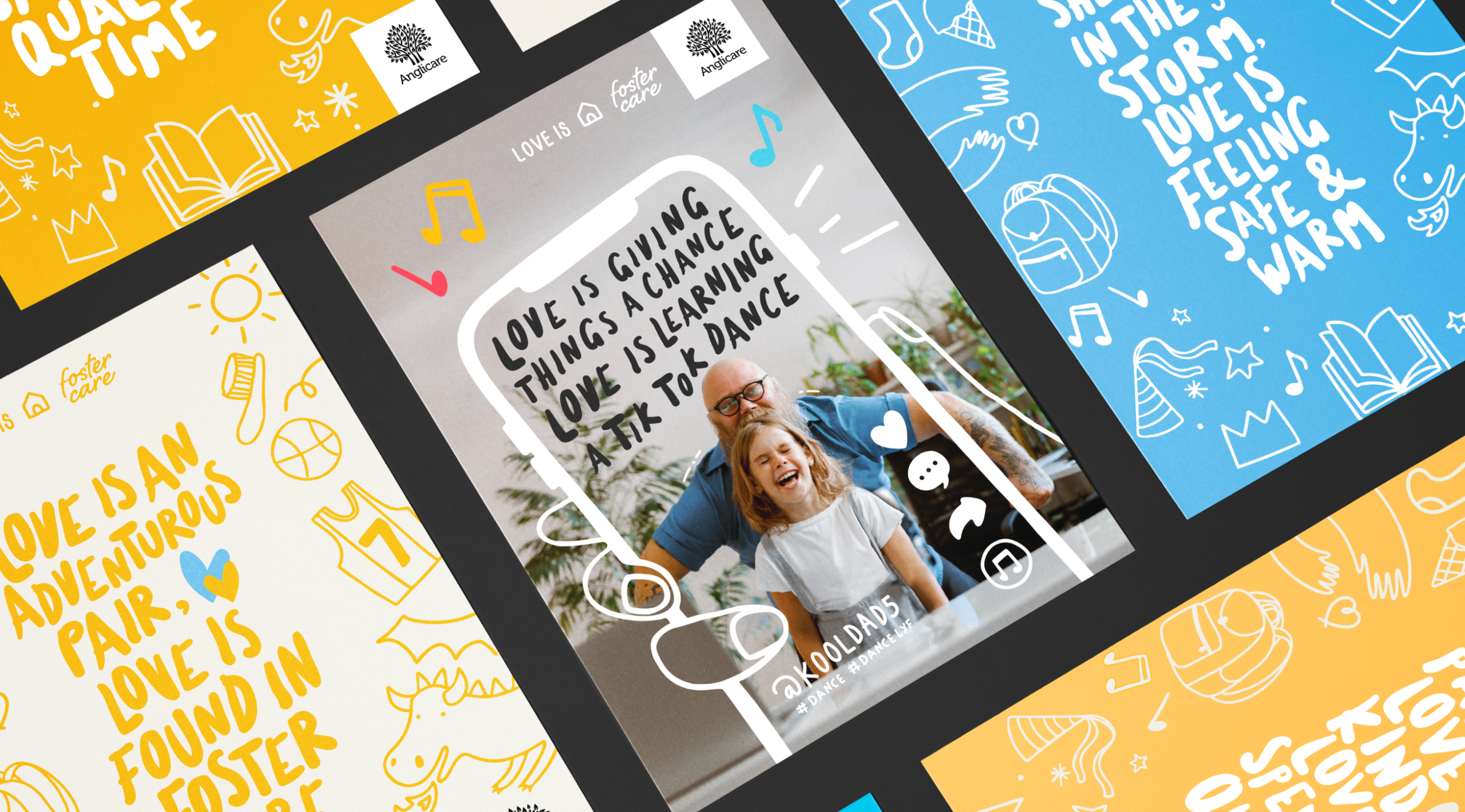
Our thanks go to the Anglicare Foster Care team for their partnership in developing this vital campaign. It was a privilege to help translate the profound need for carers into a visual identity that offers both challenge and hope. We also want to thank the foster families whose stories of “love in action” inspired our creative direction and remind us all of the beauty found in choosing to care.
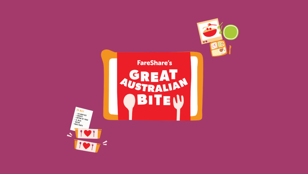
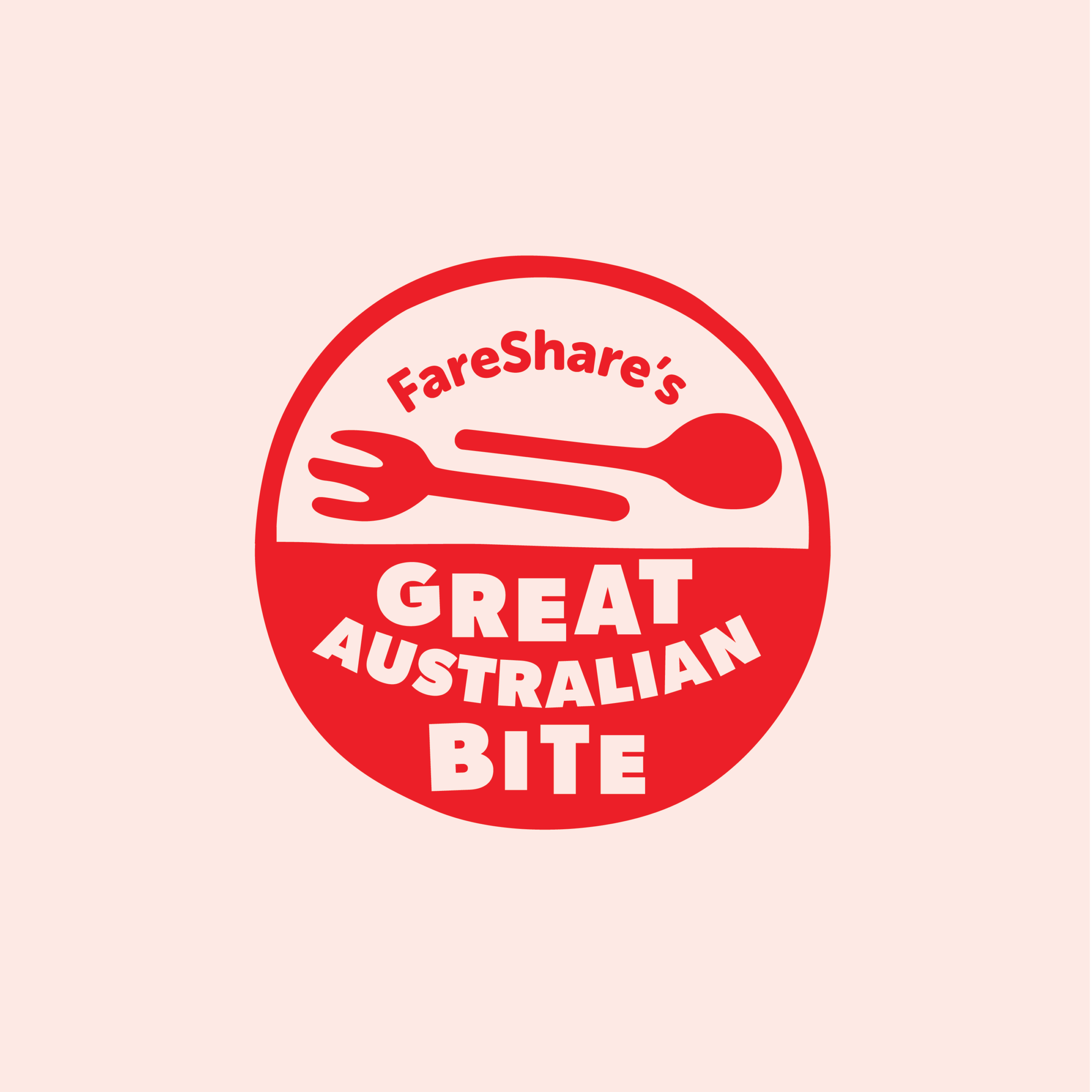
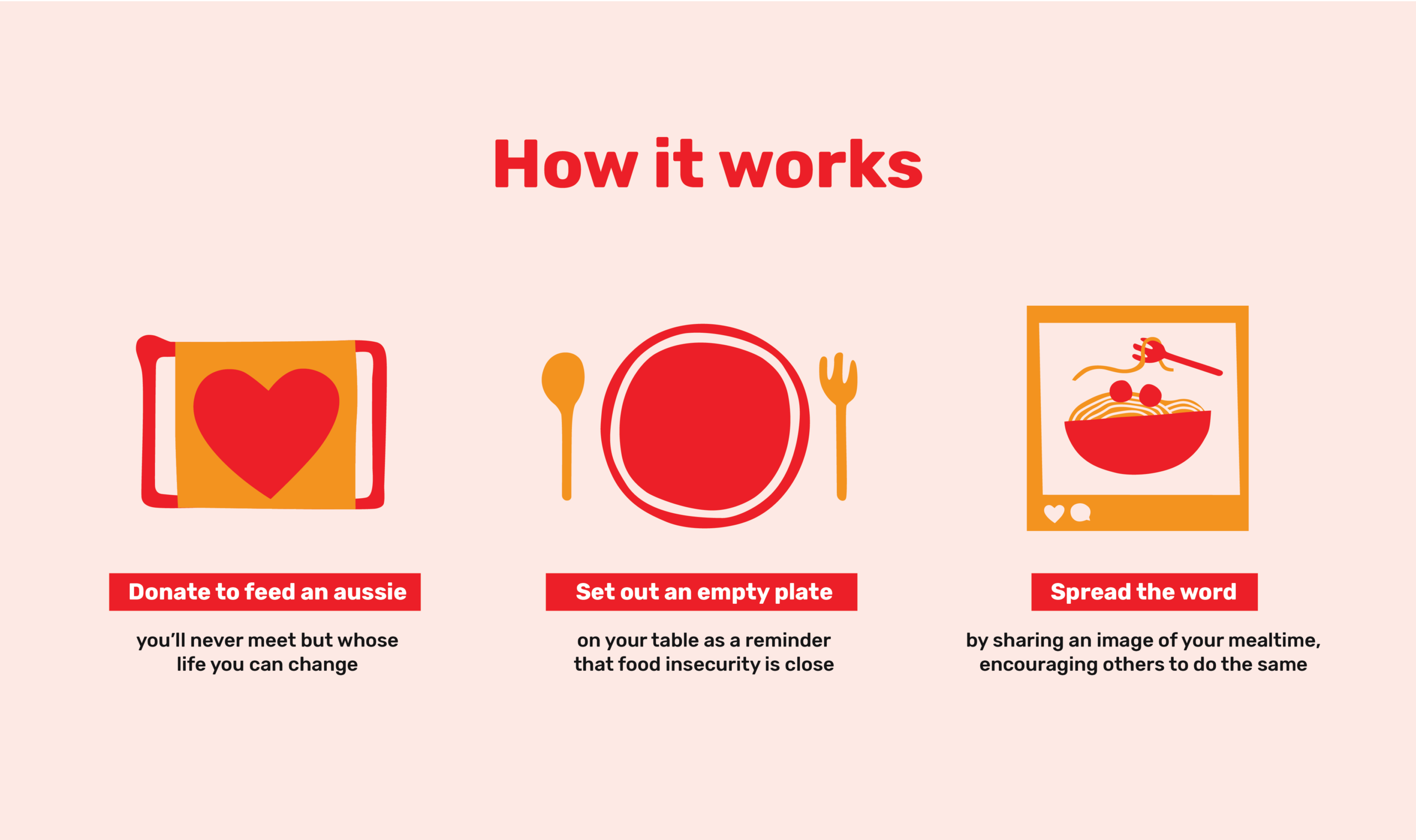
FareShare: Branding an inaugural giving day
FareShare provides nutritious meals to thousands of Australians via their charity kitchens, yet they often fly under the radar compared to larger food relief organisations. With their first-ever Giving Day on the horizon, FareShare saw a chance to not just raise vital funds, but to start a conversation that might shift the cultural narrative around food insecurity. Our challenge was to develop the campaign name, message, identity and experience. The goal was to engage new audiences, raise $100k in 12 hours, and provide a repeatable mechanism for future giving days.
- Aid and Development
- Health and Wellbeing
- FareShare
- Fundraising Strategy
- Visual Identity
- 2024
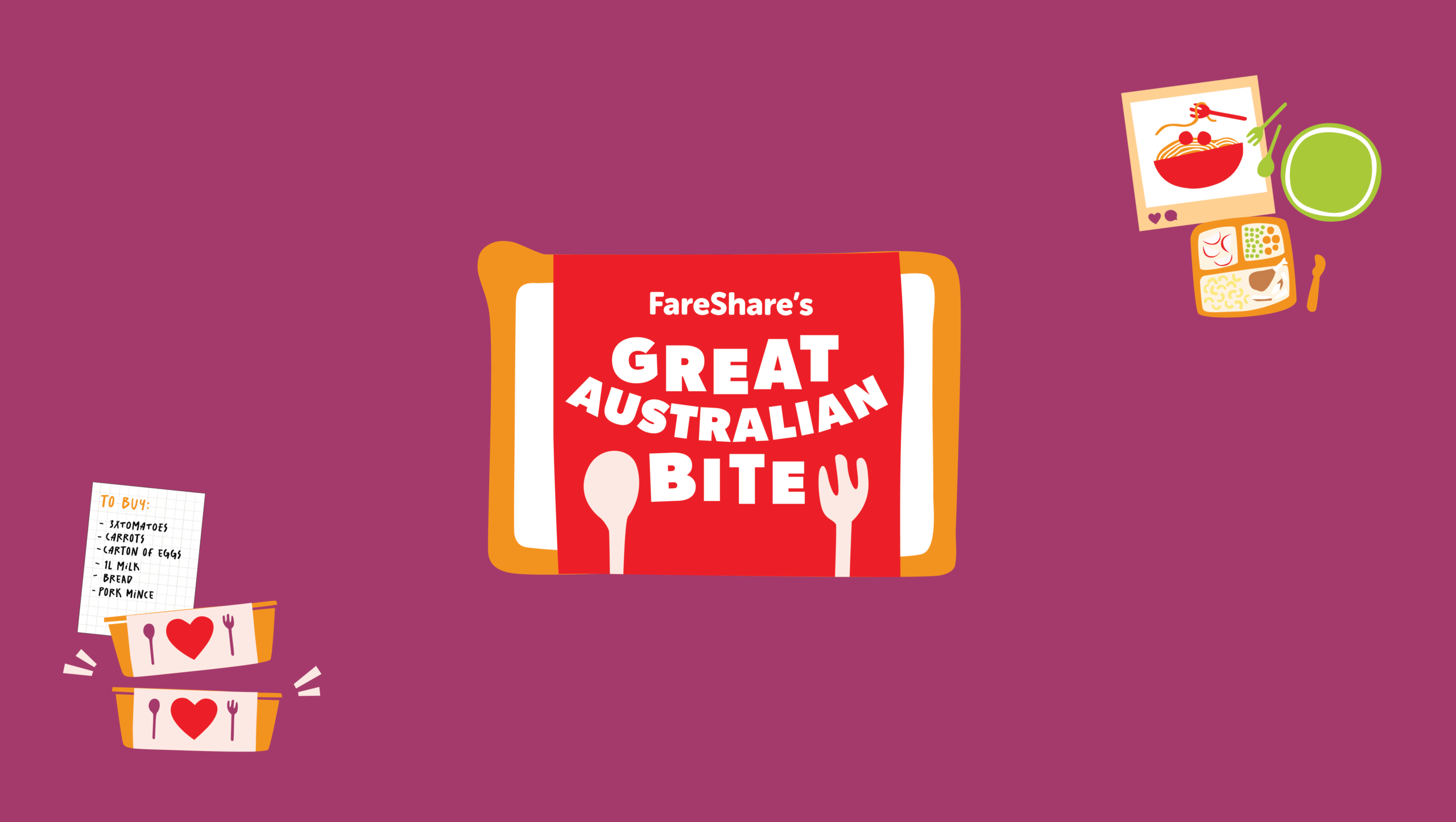
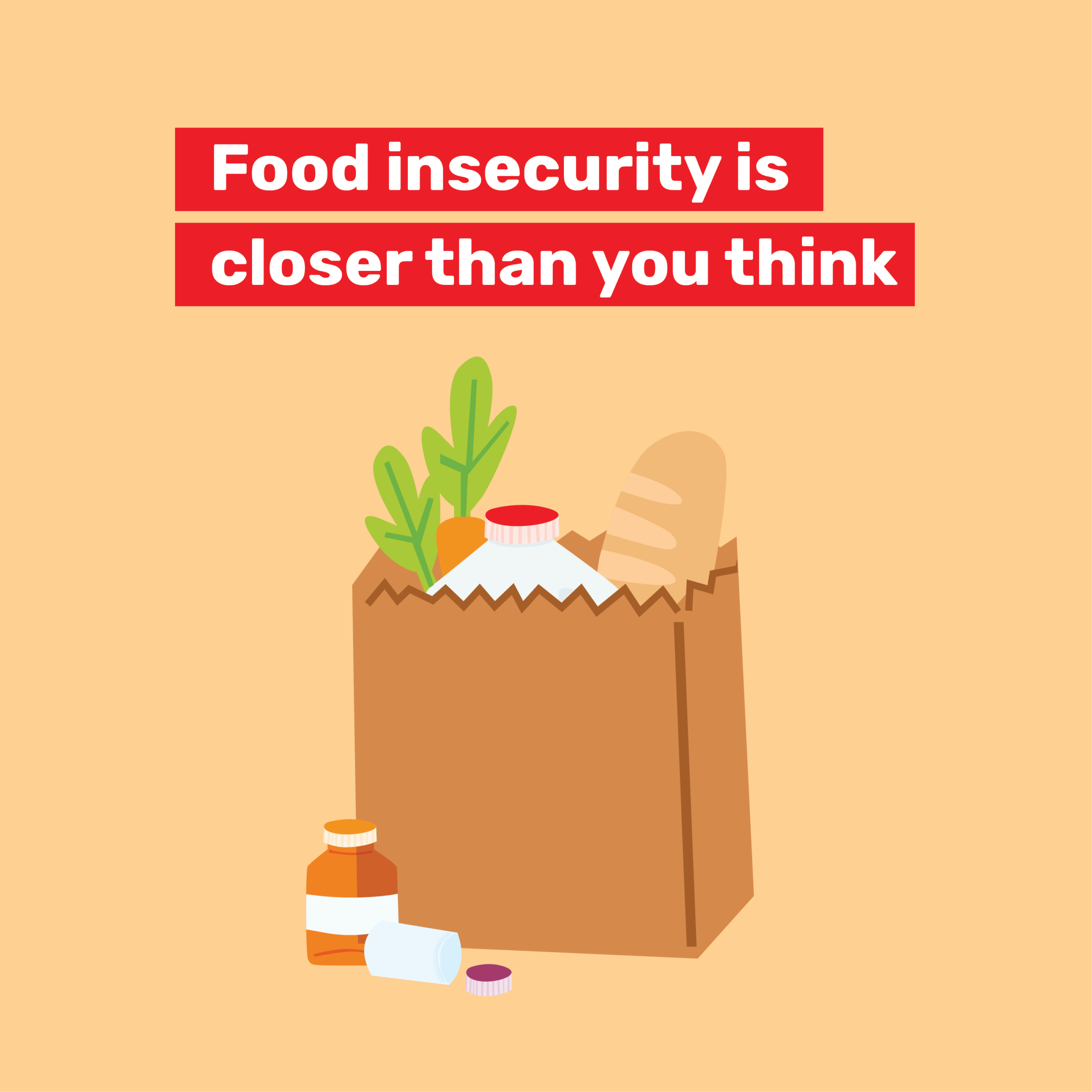

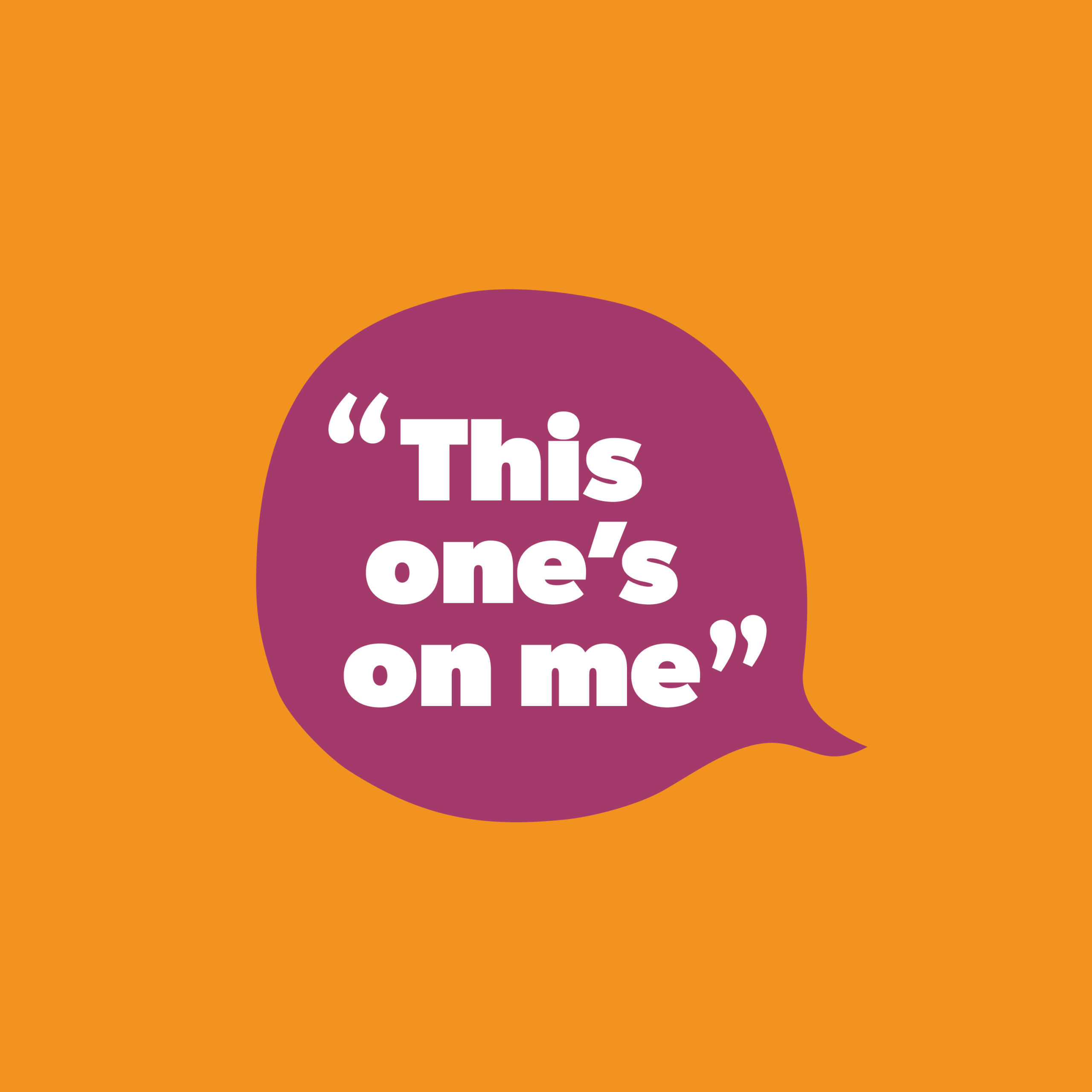
We built the campaign around a simple truth: Aussies look out for each other. If someone in your street needed a meal, you’d help.
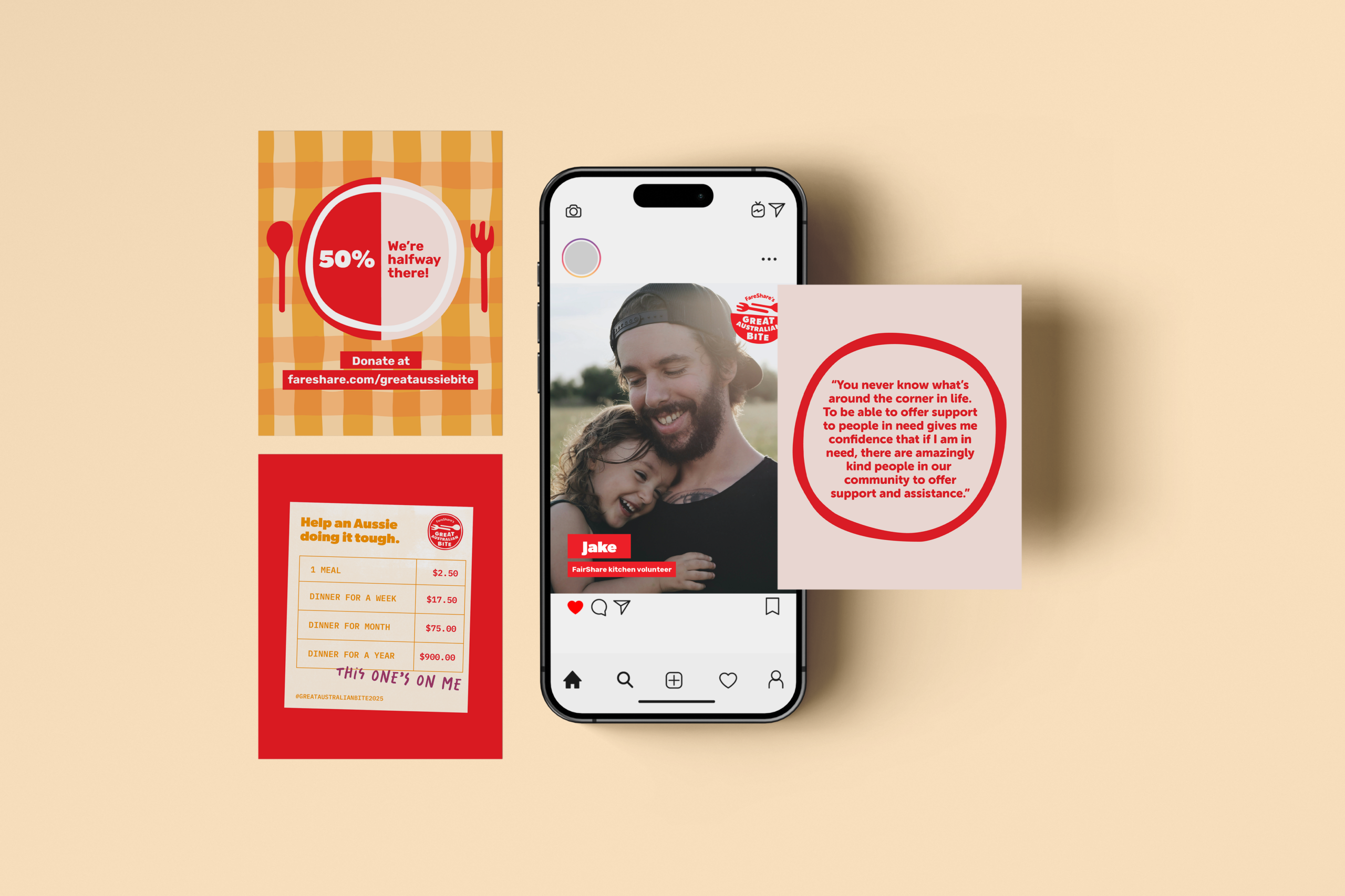

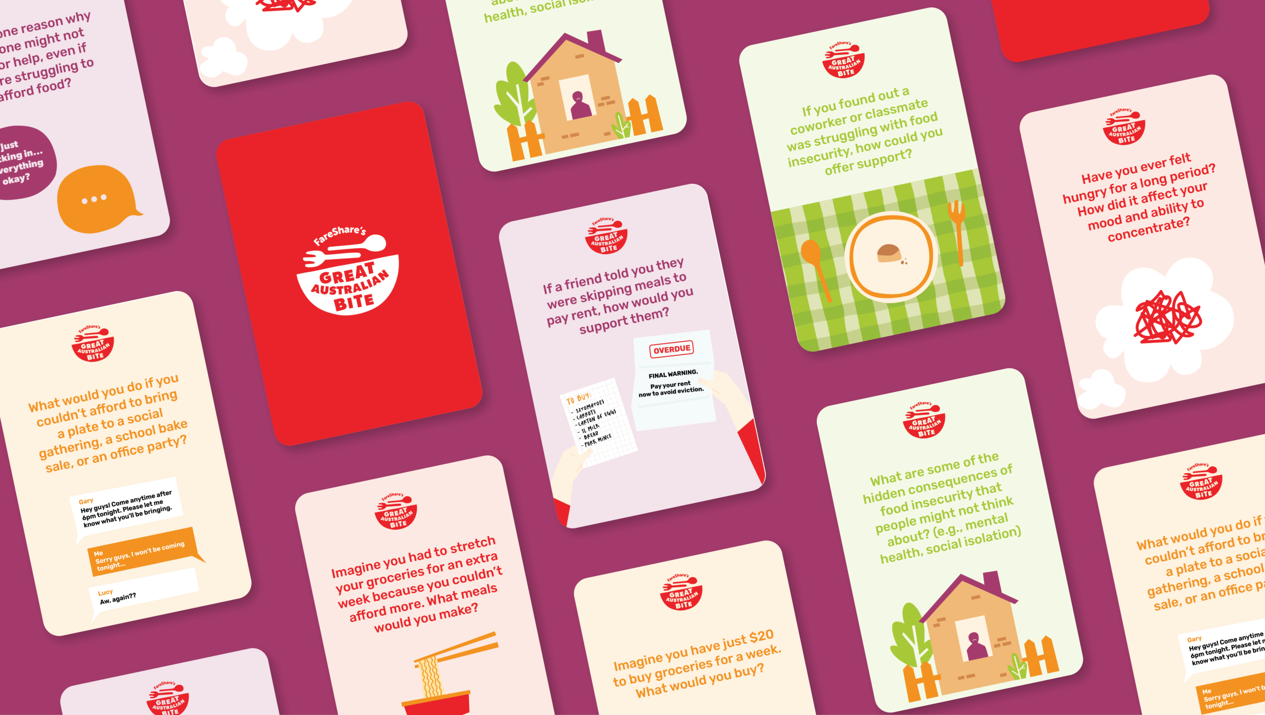
We’re thankful to the team at FareShare and SecondBite for giving us the opportunity to work on this project, and allowing us to try out creative ways to tell this important story to Australia.
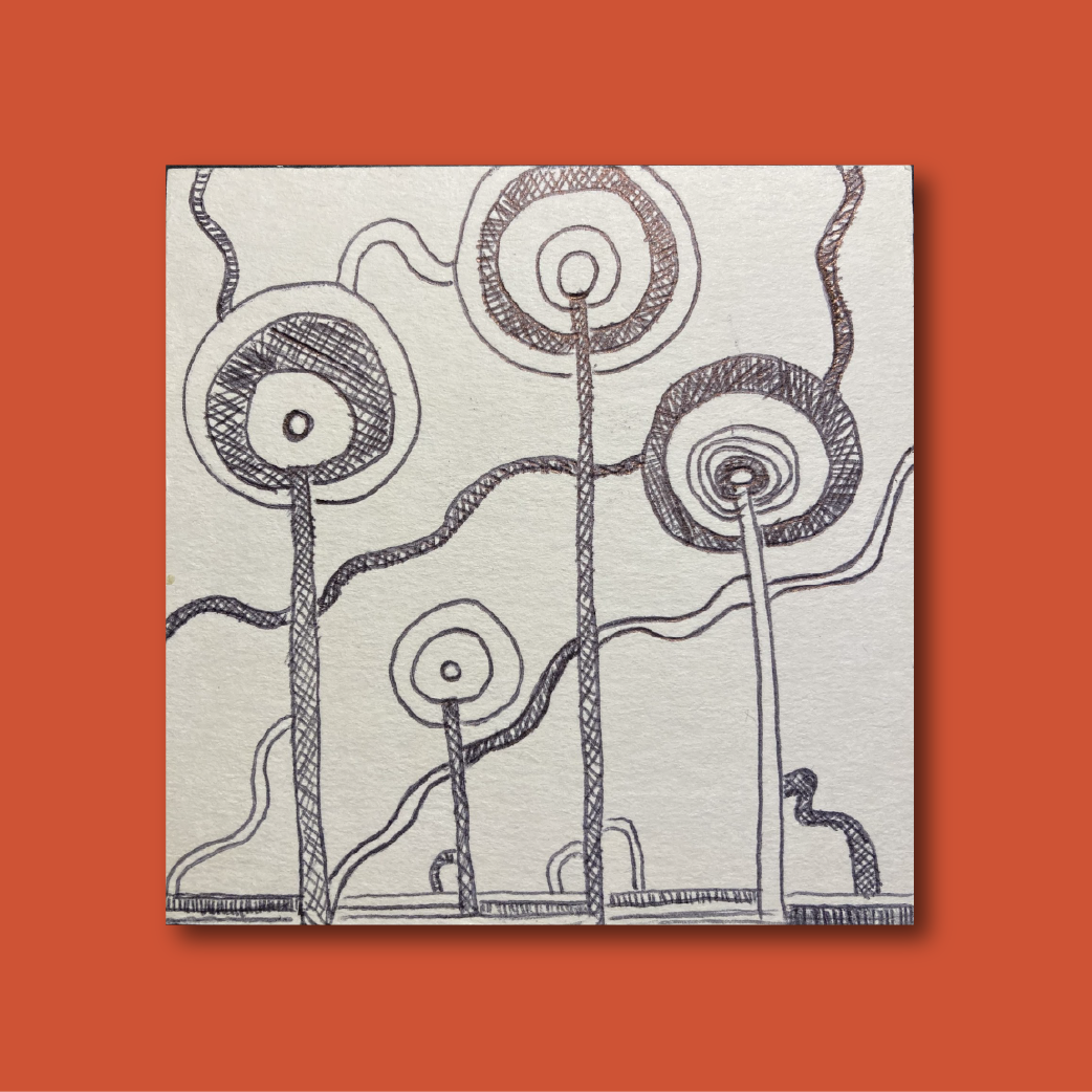
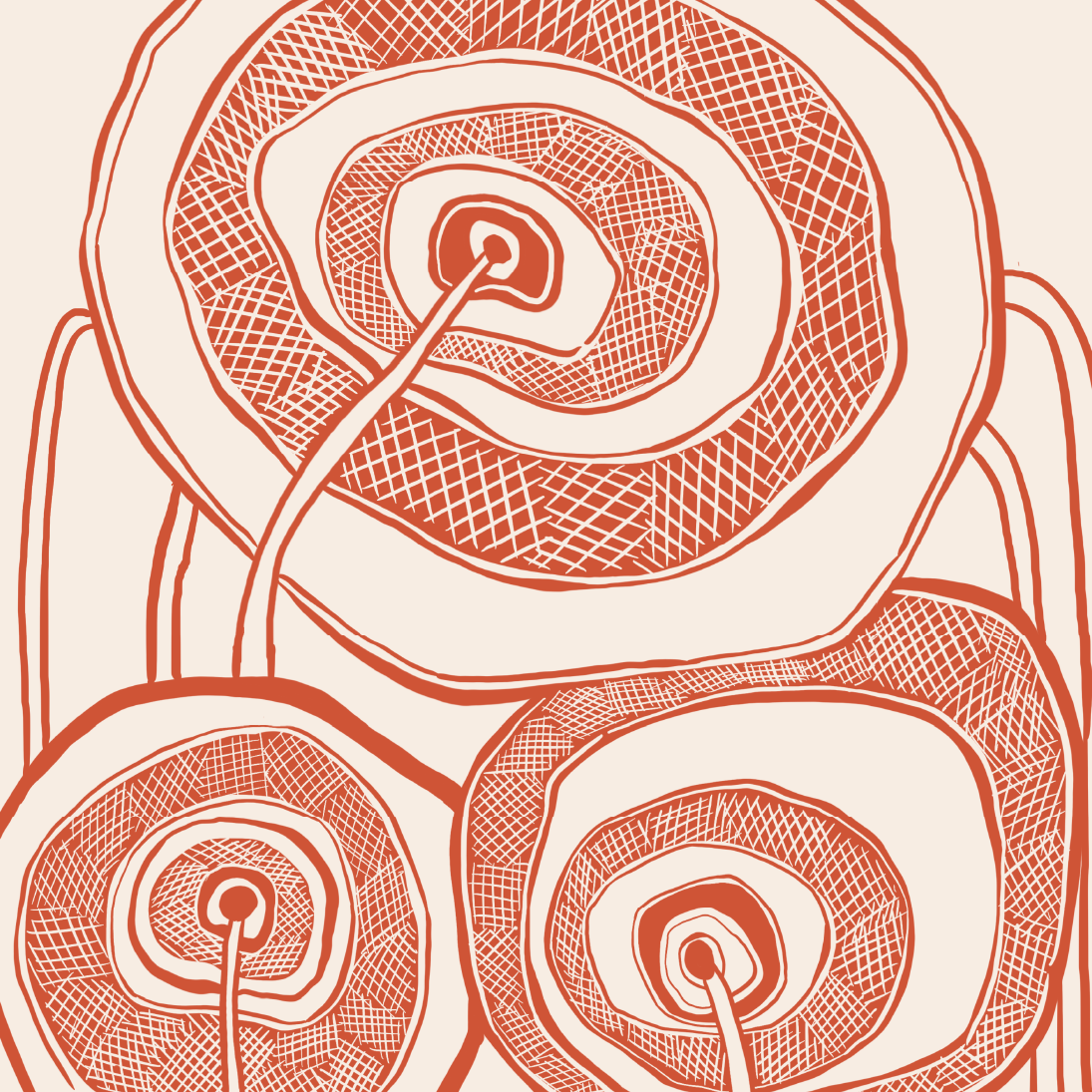
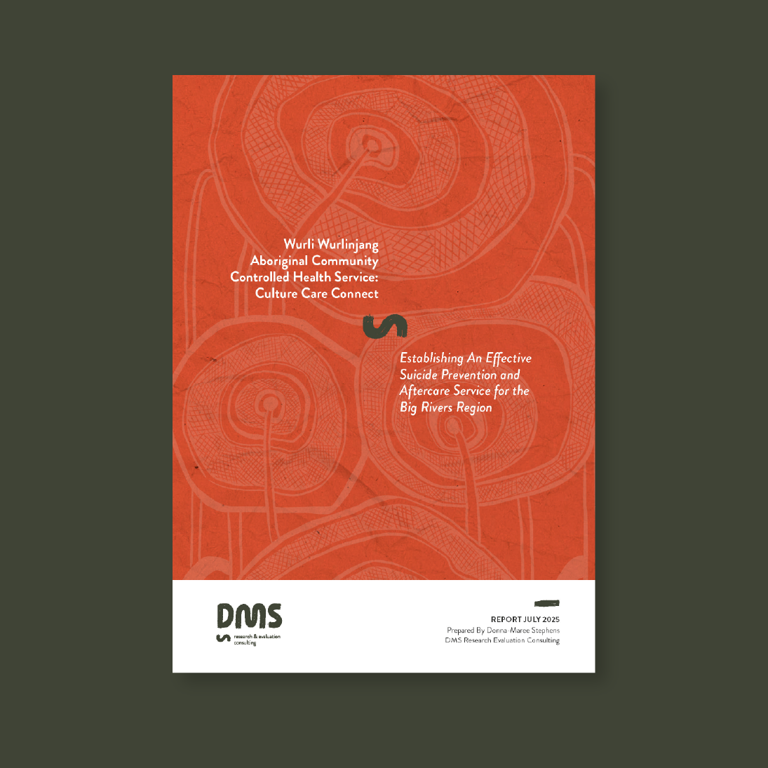
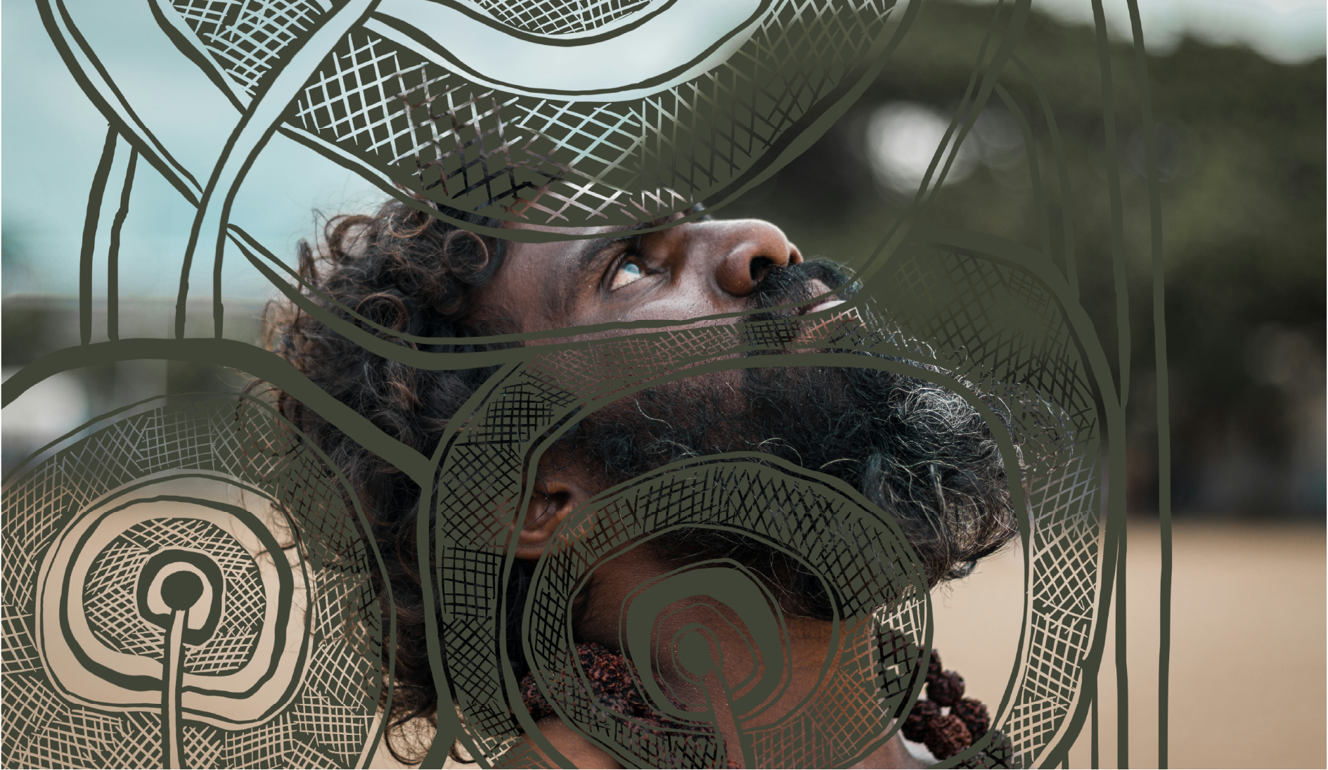
DMS: Identity inspired by original art
Cadence collaborated with First Nations researcher Donna Maree Stephens to develop a visual identity for DMS Research and Evaluation Consulting that blended her cultural background with corporate professionalism. Donna’s passion for assisting First Nations communities with research that forms the basis of life-changing policies for their people is beautiful and it was an honour to partner with her in this project.
- First Nations
- Social Enterprise
- Donna Maree Stephens
- Brand Identity & Strategy
- Print Design
- 2025
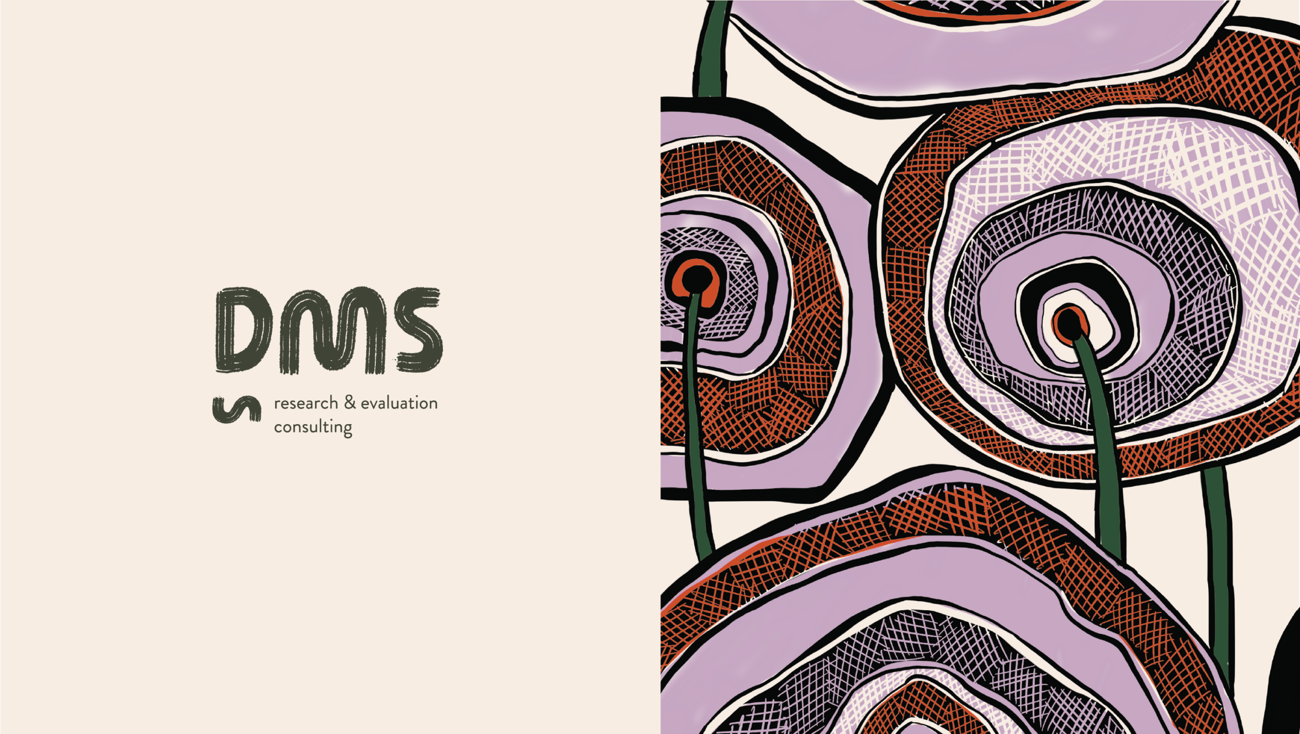
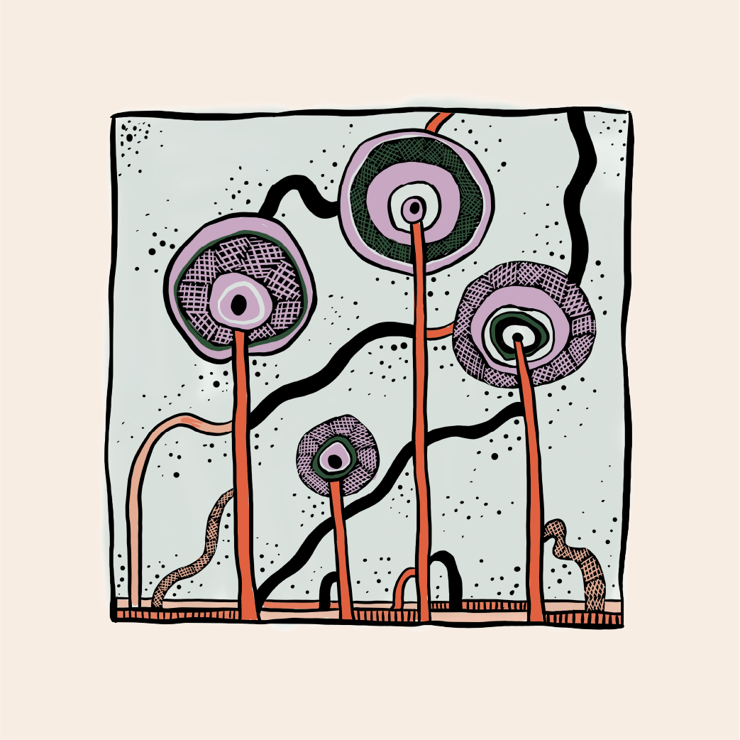
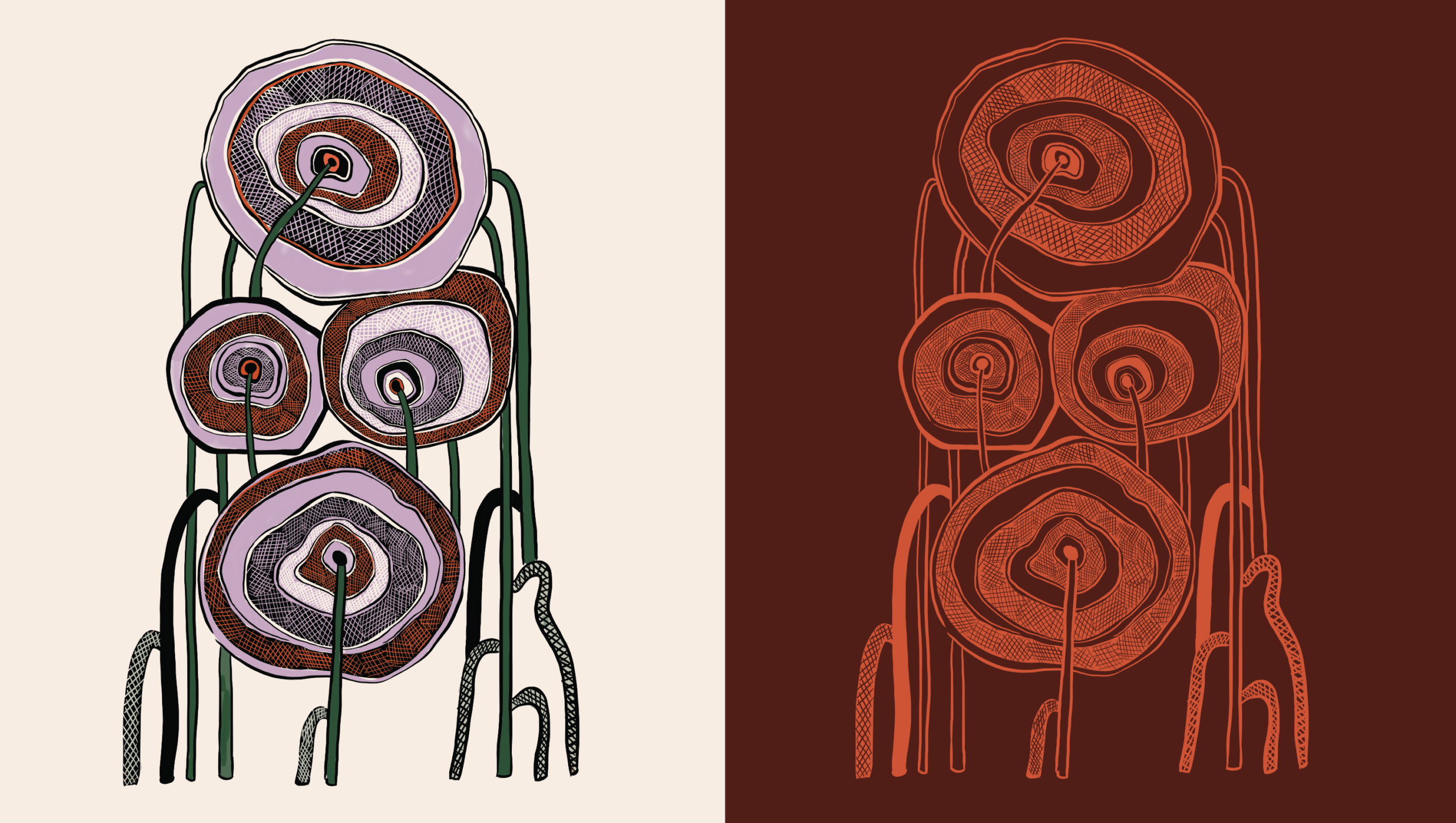
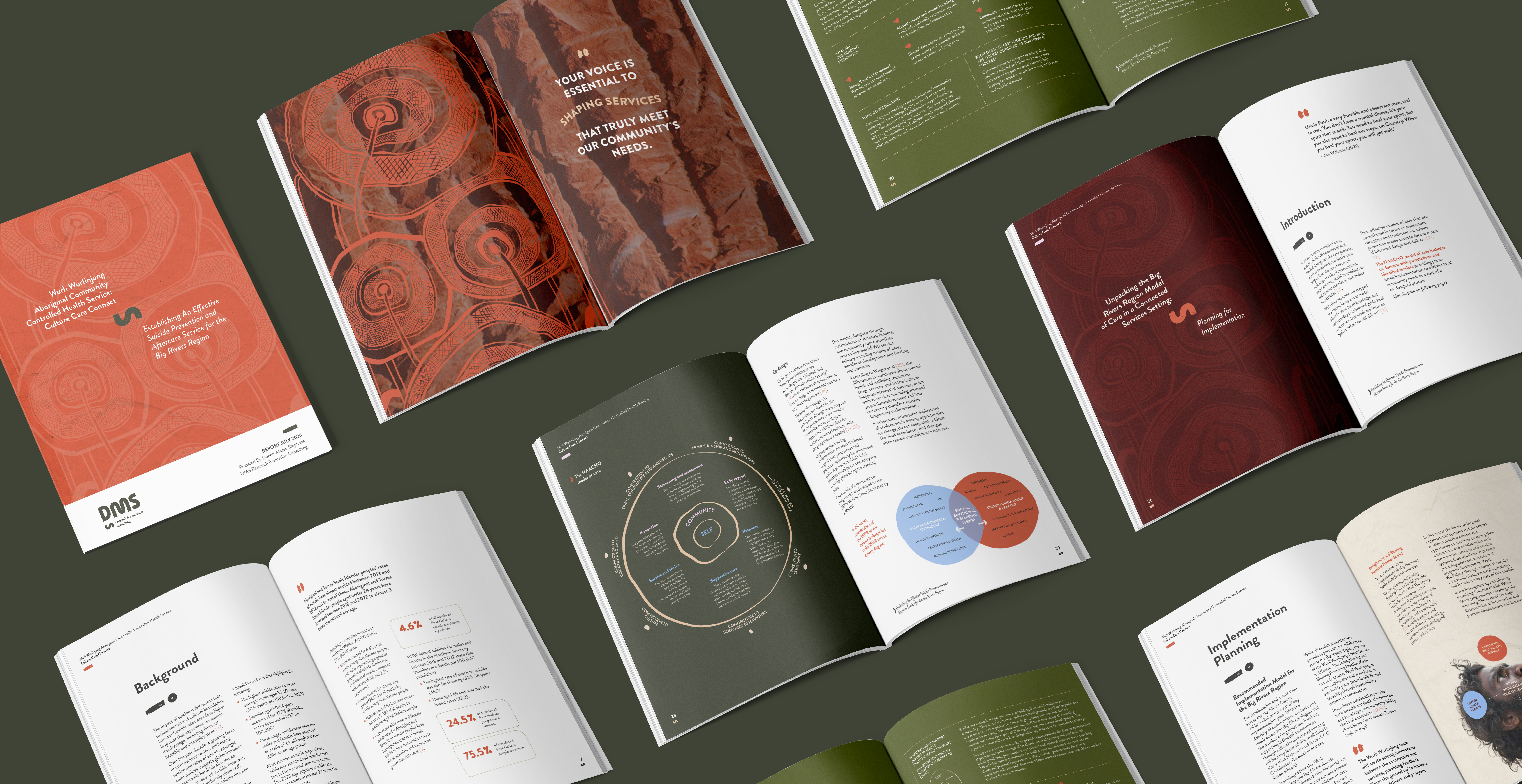
We developed a brand that feels deeply personal, yet perfectly distinct in the corporate world.
We want to thank Donna from the bottom of our hearts for trusting us with her brand, which is a true expression of her life’s work. It’s an honour for Cadence to support First Nations leaders like Donna, whose kindness and gentleness reflect the deep wisdom she brings to her research. We are excited for her future and wish her every success.